Rebecca Mapes

Why we love
this site
Pro-tip: the smaller your fonts, the more luxurious your site will feel. Before you go make your typography illegible, take a look at this client site for mixed-media artist and jeweler Rebecca Mapes.
The small text works because it's balanced by a minimal design with lots of white space. The color palette feels warm and approachable — no white box gallery here. Each line of text and photo feels artfully arranged, no matter the browser size (we checked). If you treat your portfolio site like an extension of your work, it shows!
Designed by
Mindy Nguyen,
Squarespace Design Course Student 🏆
and ilovecreatives Studio Creative Director
Platform
Want a discount? Learn more↗
Fonts Used
WT Kormelink by WiseType
Helvetica by Linotype
Colors Used
Cream
#f8f8f1
Charcoal
#1c1c1c
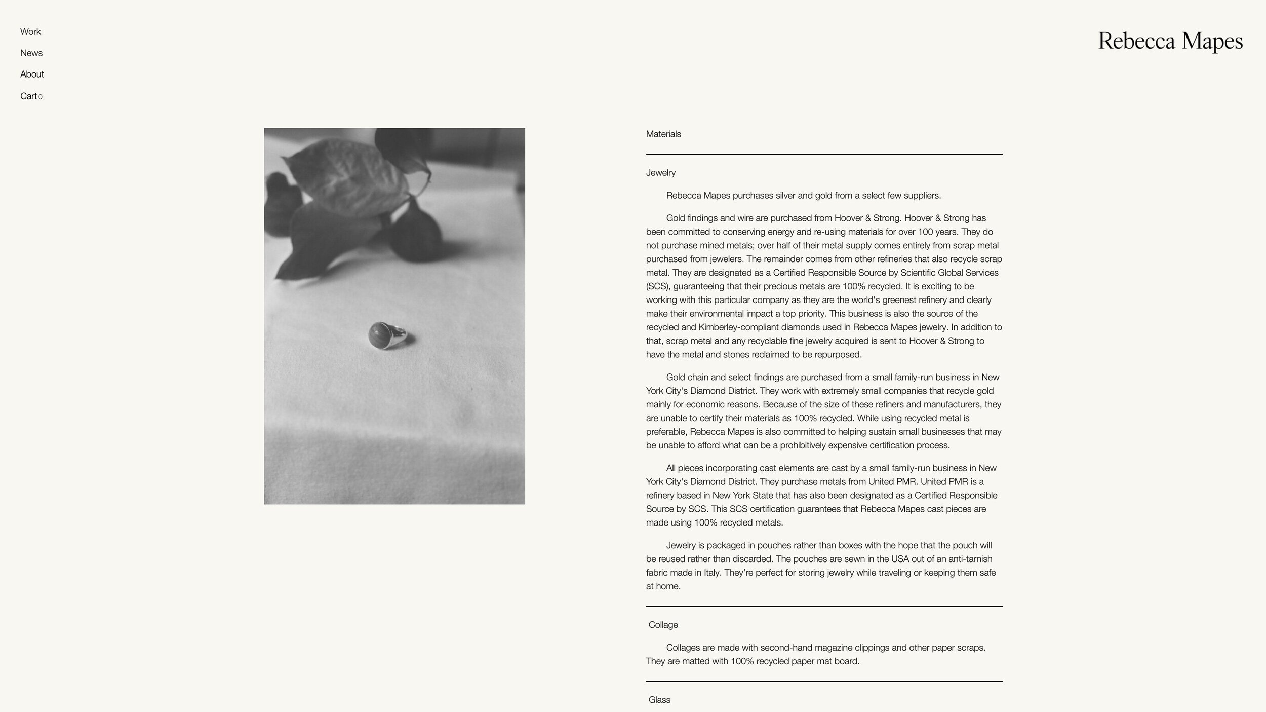
This feels very editorial, like it was pulled from a scientific journal. Love the indented paragraphs.

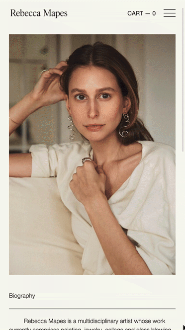
Remember what we said about small text? Triple check that it’s legible on mobile too. It’s always a fine balance between legibility and branding.
Product photography really sings when the product is given enough space to breathe. We recommend taking photos with wide margins so your product pages don’t feel cluttered. Also, you can always crop!

Super clear, simple footer. ‘Nuff said. We dig it.