NONYMOUS


Why we love
this site.

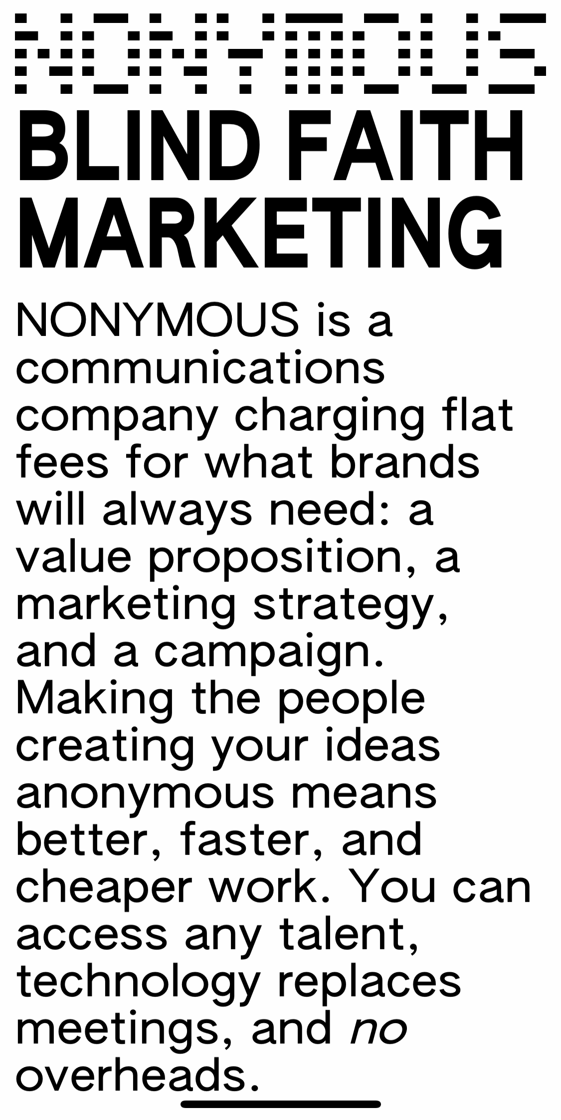
This agency’s site encourages you to keep scrolling and reading — otherwise, the subtle animations force the text to slowly slide & morph within the cube-like webpage. While it relies on custom animation, take note of the type. You could easily recreate the visual hierarchy and still have a dope site.

Found by:

Juanika Freeman


Platform

Custom

Fonts Used

Arial Narrow by Monotype

COLORS USED:

Black
#000000

White
#FFFFFF

 
This a great example of great visual hierarchy through type!

This a great example of great visual hierarchy through type!


Love the stretched type — you can tell they played around and had fun!

Love the stretched type — you can tell they played around and had fun!


Looks great on mobile too.

Looks great on mobile too.


So cool how the stretched type becomes it’s own branded pattern. Try this yourself in a design program (we like Figma!).

So cool how the stretched type becomes it’s own branded pattern. Try this yourself in a design program (we like Figma!).