Pauli & Sisters


Why we love
this site

Right off the bat — I get friendly, soft and gentle vibes. This is a family-run skincare brand, and you can tell that they care and want you to, too. Everything from the photography to the ever-so-slight serif typeface feels approachable.

While their focus on formulations and ingredients could get heady, the airy layout and strong typographic hierarchy keep you engaged.


Found by:

Sarah Campbell
ilovecreatives Studio Art Director


Platform

Shopify

Fonts Used

Cooper Lt BT Light by Linotype
Sharp Sans by Sharp Type

Colors Used

Avocado
#d8ffa4

Oat
#f3f4f2

Sky
#d0e3ff

Forest
#152800

Tangerine
#ff7637


Love how the brand colors of pale green, orange and blue appear in small moments, from the web layout to the custom photography.

Love how the brand colors of pale green, orange and blue appear in small moments, from the web layout to the custom photography.


This is an e-commerce photo done right — lots of room for the product to breathe, while showing off the bottle and packaging.  Also that cuteeee af pedestal!

This is an e-commerce photo done right — lots of room for the product to breathe, while showing off the bottle and packaging. Also that cuteeee af pedestal!


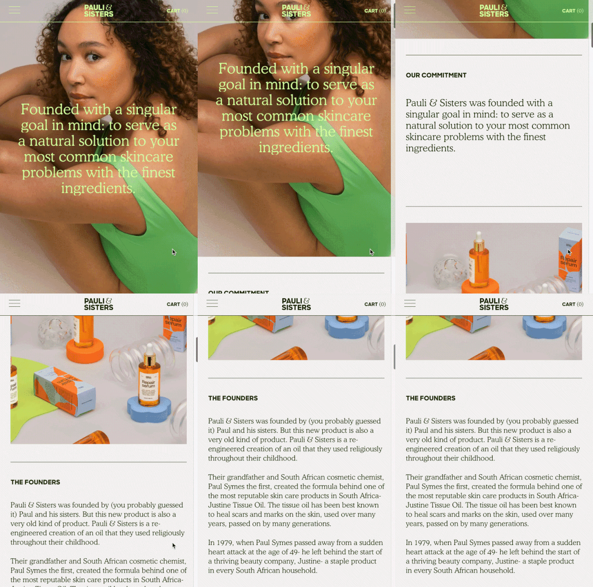
Check out that Mobile View.

Check out that Mobile View.


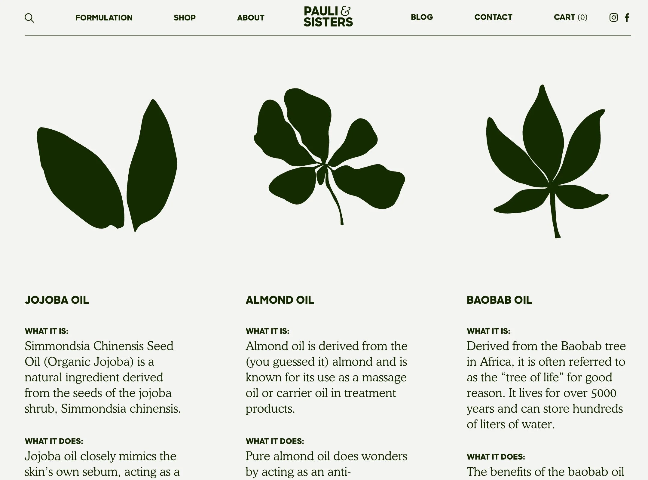
What a fun way to break down an ingredient list! Super simple, with elegant illustrations.

What a fun way to break down an ingredient list! Super simple, with elegant illustrations.