StudioAlmond


Why we love
this site.

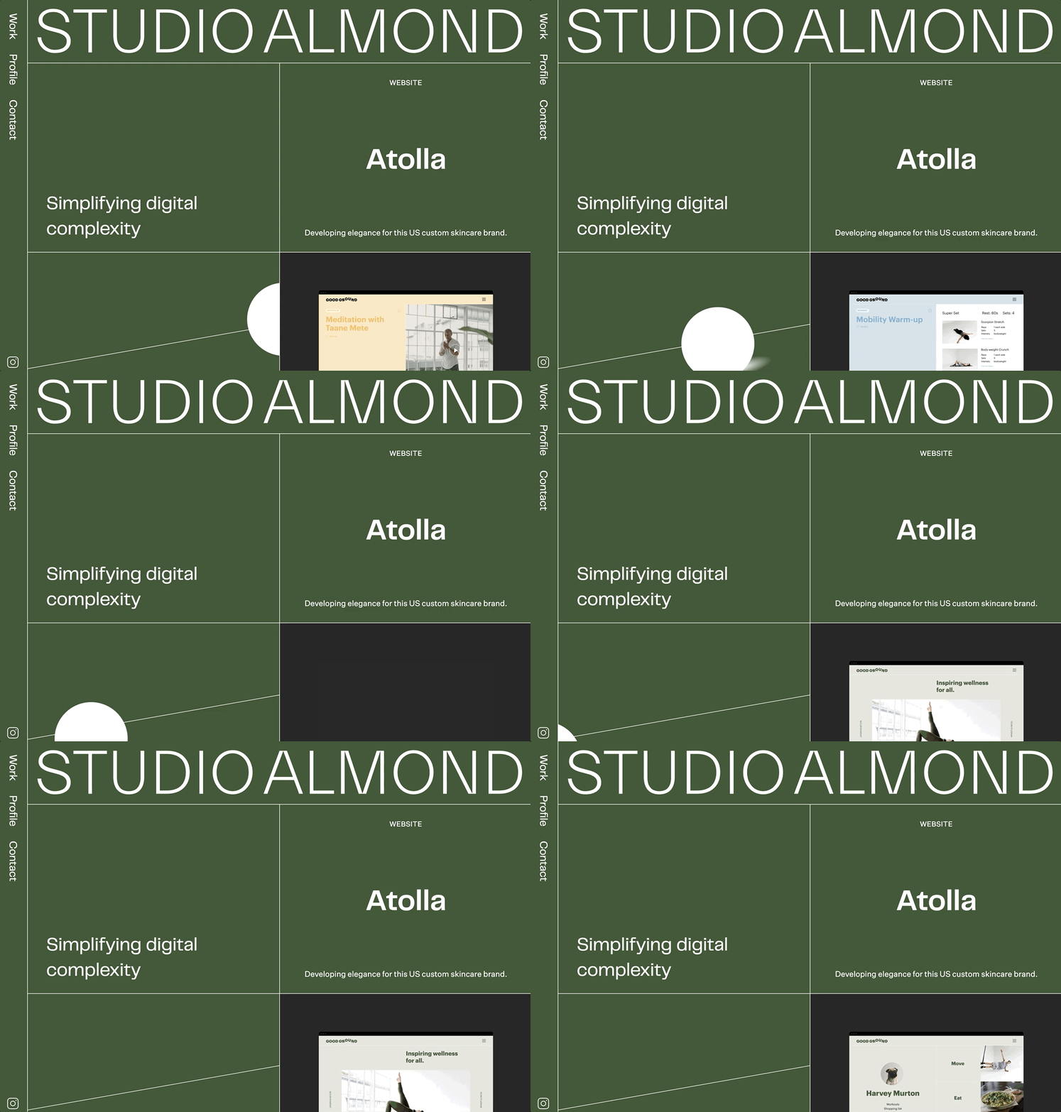
StudioAlmond’s site opens with the mission of “simplifying digital complexity.” It does just that. Cue an earthy, monochromatic palette and a relentless grid structure. Love the abstract graphics. With clients like Apple, Tame Impala, Harrods, and Jo Malone, the boutique agency’s website reflects their carefully selected clients and thoughtful work.

Found by:

Katrien Declerck,
Squarespace Design Course student


Juniper
#435938

Charcoal
#282828

 
Super cool that the background changes for client work. The type is strong too.

Super cool that the background changes for client work. The type is strong too.


Small animations as you scroll add moments of delight.

Small animations as you scroll add moments of delight.


Ugh, love the simplicity of this contact form + the sticky scroll.

Ugh, love the simplicity of this contact form + the sticky scroll.


Pay attention to the type hierarchy here. It’s masterclass in legibility and creating a sense of modern luxury.

Pay attention to the type hierarchy here. It’s masterclass in legibility and creating a sense of modern luxury.