Adding Drop Shadows
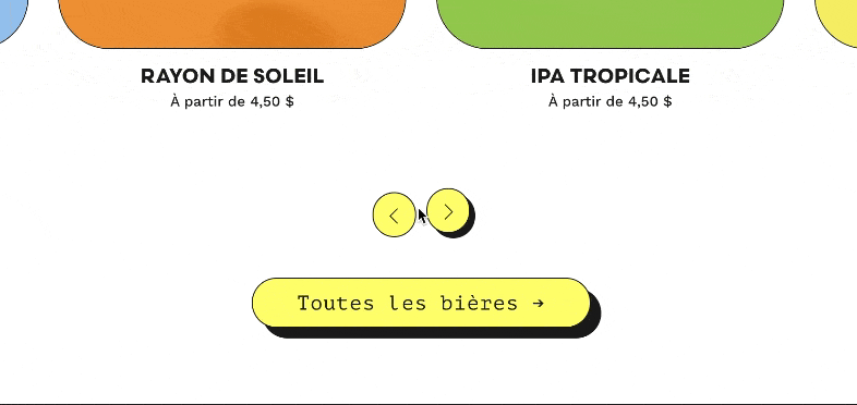
Add an interactive drop shadow effect to your buttons and nav — similar to what Trophy Student Valerie Hanson did for their custom site.
CSS
Buttons:
/* BUTTON DROP SHADOW *******/

.sqs-block-button-element  {
  box-shadow: 10px 10px #1D1D1B;
  border: 1px solid #1D1D1B !important;
  transition: all ease-in 0.2s !important;
  white-space: nowrap;
}

.sqs-block-button-element:hover {
  box-shadow: none;
  transform: translateY(4px) !important;
  transition: all ease-in 0.2s;
  opacity: 1 !important;
}
Summary block (carousel) arrows:
/* CAROUSEL ARROW DROP SHADOW ******/

.sqs-gallery-design-carousel .sqs-gallery-controls .next {
  background-color: #FFFF73;
  border-radius: 50px;
  color: #000;
  padding: 12px;
  box-shadow: 5px 5px #1D1D1B;
  border: 1px solid #1D1D1B !important;
  transition: all ease-in 0.2s !important;
}

.sqs-gallery-design-carousel .sqs-gallery-controls .next:hover {
  box-shadow: none !important;
  transform: translateY(4px) !important;
  transition: all ease-in 0.2s;
  opacity: 1 !important;
}

.sqs-gallery-design-carousel .sqs-gallery-controls .previous {
  background-color: #FFFF73;
  border-radius: 50px;
  color: #000;
  padding: 12px;
  box-shadow: 5px 5px #1D1D1B;
  border: 1px solid #1D1D1B !important;
  transition: all ease-in 0.2s !important;
  opacity: 1 !important;
}


.sqs-gallery-design-carousel .sqs-gallery-controls .previous:hover {
  box-shadow: none !important;
  transform: translateY(4px) !important;
  transition: all ease-in 0.2s;
  opacity: 1 !important;
}