Hajinsky

Why we love
this site
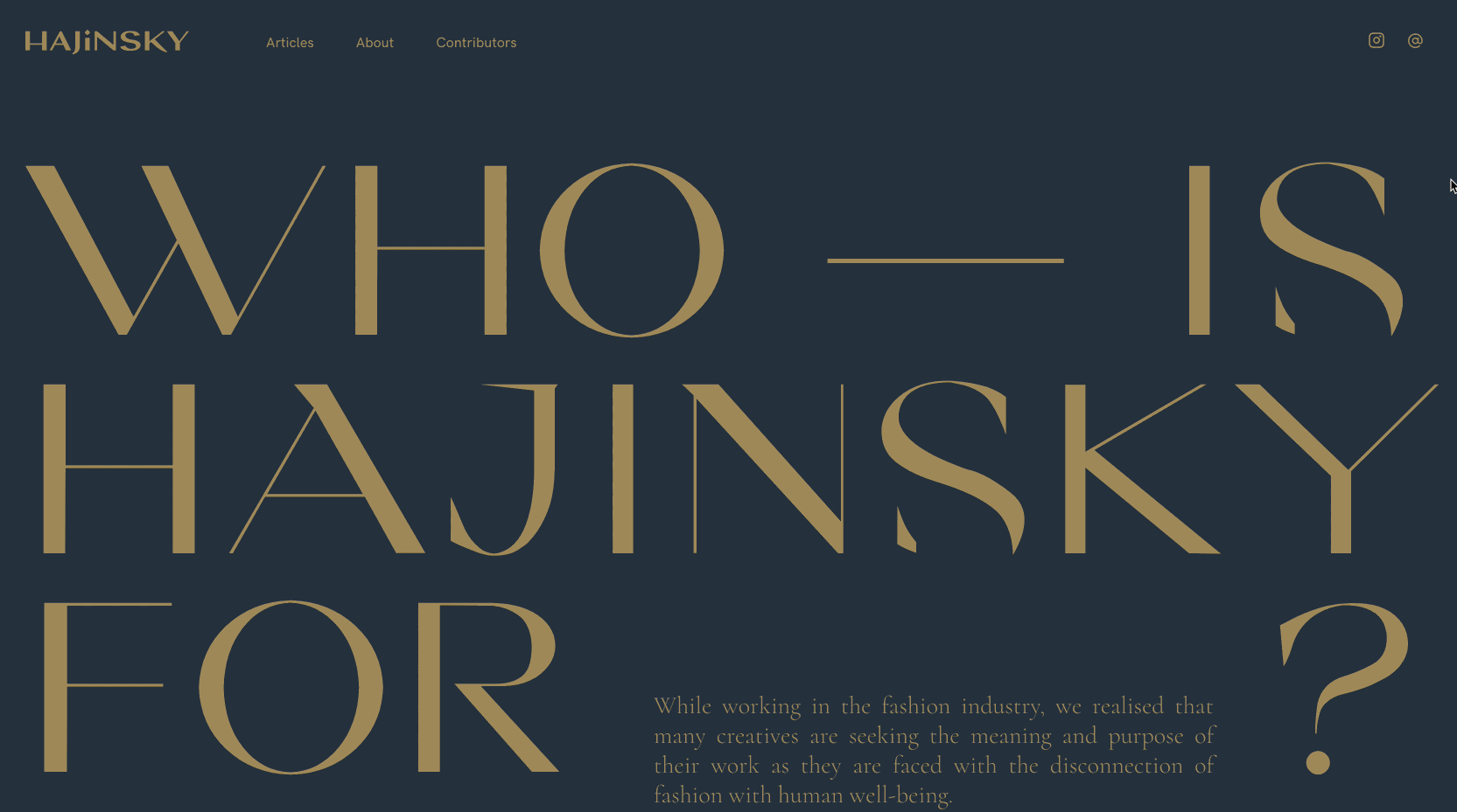
This online magazine is all about fashion and psychology — and the design shows that. Not too editorial, not too academic, not too modern, this site is just right. The stylish all-caps serif font feels luxurious, and oooh that warm color palette!
Notice how the About Page layout feels ripped from a print magazine. Often web designers are wary of too much text, but with the right margins and visual hierarchy, the copy is easy (and fun!) to read. For a similar style, checkout @akuku.studio's work.
Found by:
Platform
Fonts Used
Cosi Times by Nikolas Type
HK Grotesk by Hanken Design Co.
Cormorant Garamond by Catharsis Fonts
Colors Used
Mud
#994c41
Grey
#E6E6E6
Navy
#243546
Mint
#d2d9c5
👀 See how this repeated copy creates a typographic design pattern?

This is a great example of visual hierarchy! 🧐 Damn, that 5 is HUGE - but it works.

Check out that Mobile View.

Pro tip: Use your eyedropper tool to match your background with your photography. This makes the page feel cohesive and effortless!