Opal Skincare
Why we love
this site
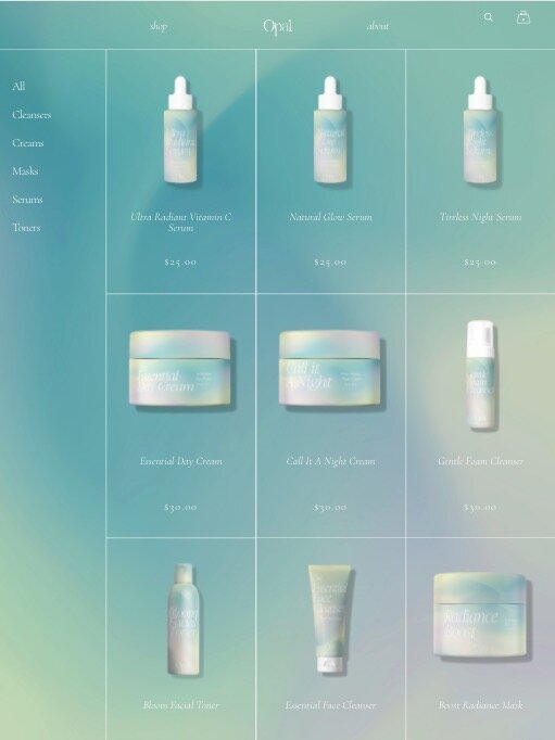
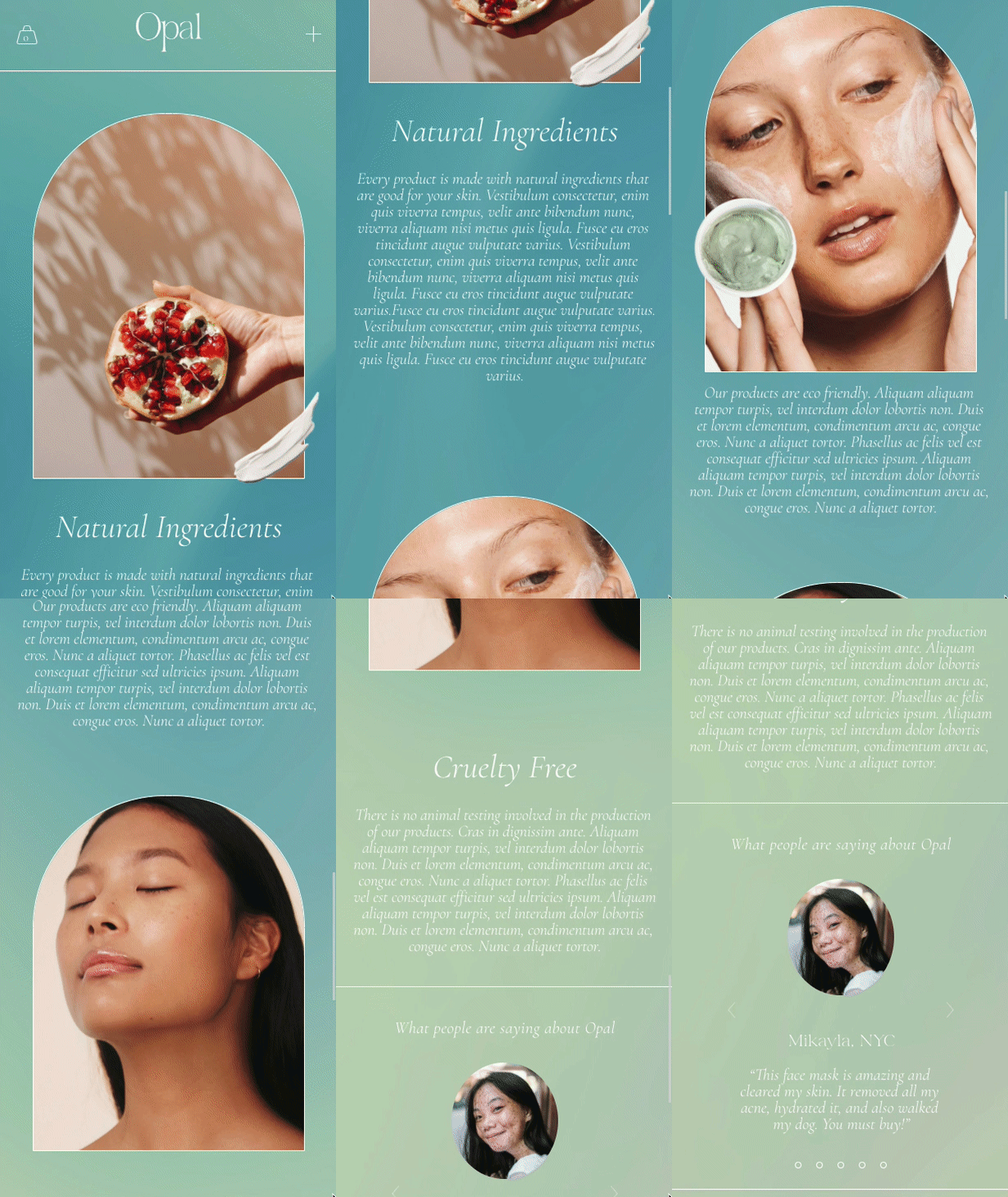
OK, we'd buy Opal products in a heartbeat. ☁️This dreamy mock skincare product has some impressive, fully realized branding — from the packaging copy to the natural-looking photography mock-ups. Love the continual gradation in the background — keeps the page flowing effortlessly. Subtle animations and hover effects feel sharp and smooth.
This site was made by our Squarespace Design Course student Brenda Santillan. Check out her Instagram account documenting her behind-the-scenes process (it's amazing!).✨
Designed by:
Platform
Want a discount? Learn more↗
Font Used
Aequitas by Fenotype
Cormorant by Catharsis Fonts
Colors Used
White
#ffffff
Teal
#7ba39d
Branded CSS animations like this sparkle effect really go the extra mile. Totally doable within Squarespace too!
Love this layout — it organizes each floating product within an elegant and modern grid structure.
Layering imagery AND framing with interesting shapes? Now that we can get into.
SO smart to add modeled lifestyle shots on hover!


