J.Hannah Jewelry


Why we love
this site.

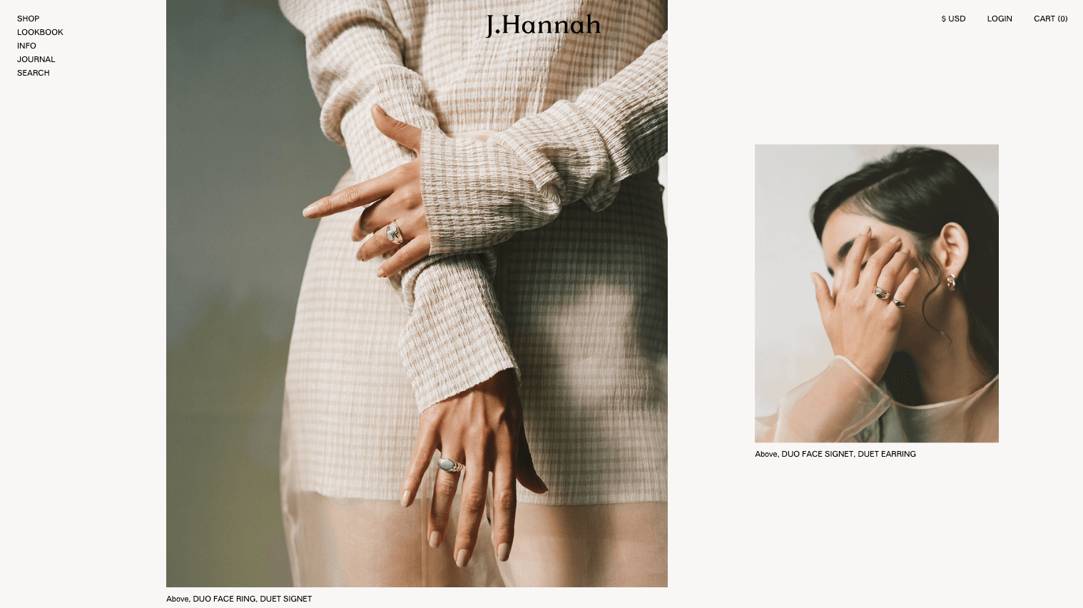
When I say that this is my favorite site on the web, I'm not kidding. It's one of the first places I'll bring my clients for inspiration. The best part? It doesn’t feel like a website at all.

Notice all those subtle touches — from the scientific journal-like layout, the off-white background, to the indented paragraphs. For additional inspiration, check out the Jess Hannah Journal designed by Natasha Mead and developed by Puno (on Squarespace).

Found by:

Gabriel Brown,
ilovecreatives Studio

Designed & Developed by:

Natasha Mead


Platform

Shopify

Fonts Used

Folio by Tilde
Cigars by Heavyweight

Colors Used

Milk
#F8F7F6

Black
#000000

 
Love the balance between the graphic header and teeny body text.

Love the balance between the graphic header and teeny body text.


That photography, so crisp.

That photography, so crisp.


The nav’s hierarchy is clearly defined by simple indentations.

The nav’s hierarchy is clearly defined by simple indentations.


YES to those large images. They look great when they take over half of the page in contrast with the minimal text.

YES to those large images. They look great when they take over half of the page in contrast with the minimal text.