Josefine Laul

josefine-laul-homepage-1.gif


Why we love
this site.

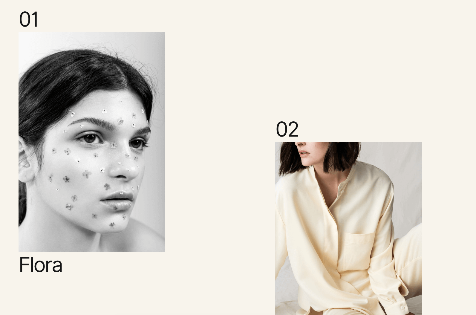
Photography portfolios tend to look similar. Just a white background with some assortment of an image grid. It's a breath of fresh air to see Josefine really change things up.

This layout works particularly well because you get to curate a beautiful homepage while showcasing a breadth of images on each project page. Nothing feels left out and the white space and off-grid layout make things feel fashion-forward.

Found by:

Gabriel Brown,
Slashie Designer and Creative

Designed / Developed by:

István Vasil


Platform

Custom

Fonts Used

Inter by Rasmus Andersson

Colors Used

Twilight
#F8F4EC

Hunter
#181818


Pro tip: Use your eyedropper tool to match your background with your photography. This makes the page feel cohesive and effortless!

Pro tip: Use your eyedropper tool to match your background with your photography. This makes the page feel cohesive and effortless!


Stacking your images left and right-aligned is a cool way to balance your content.

Stacking your images left and right-aligned is a cool way to balance your content.


Check out that mobile view.

Check out that mobile view.


Create an editorial look with varying sized images, think full-bleed and margins.

Create an editorial look with varying sized images, think full-bleed and margins.