Mineral Health
Why we love
this site
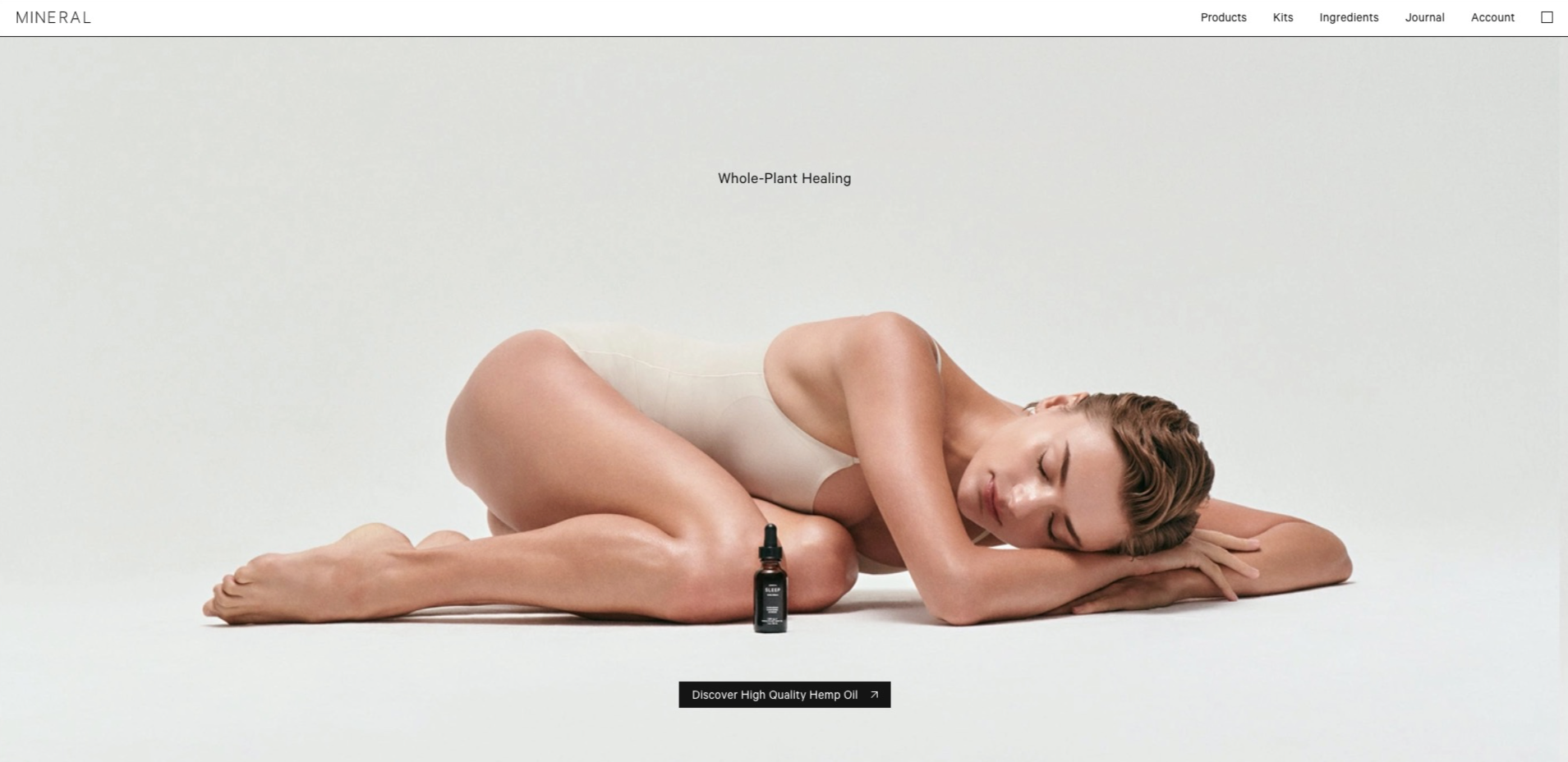
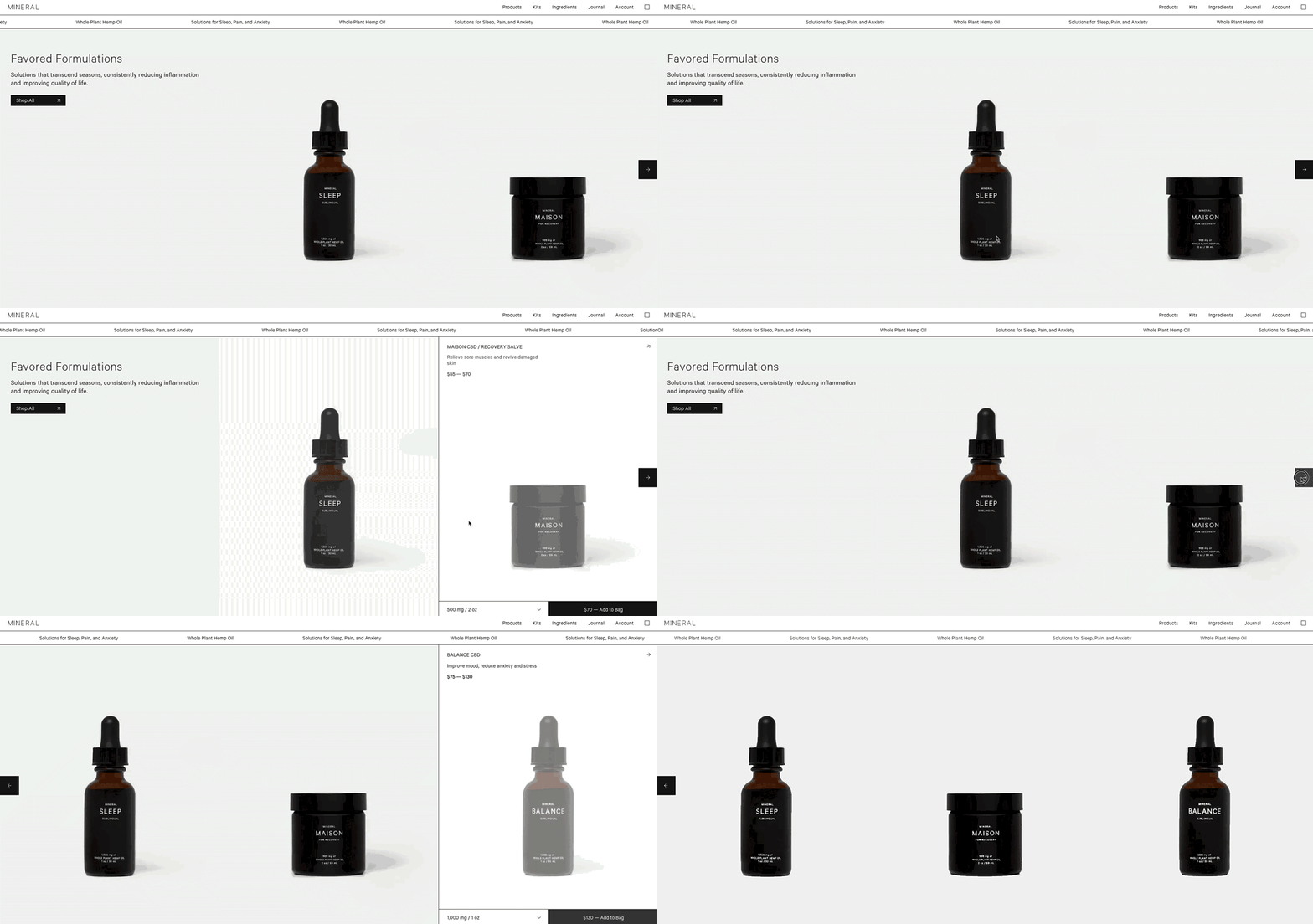
Mineral is a CBD company with a variety of ingestible and topical products. Notice how the homepage feels balanced and serene? Using a border grid design like this gives an organized and 🧽 squeaky clean look.
Pro tip: Keep your font small when you want your product imagery to do the talking. Want to grab someone's attention? Consider an animated marquee to display a special message.
Found by:
White
#FFFFFF
Black
#000000


