Standard Dose

Why we love
this site
Check out the Standard Dose homepage. Notice the Announcement bar that sits vertically to the left? Using a 💥 pop of color - like this dark teal - can be a subtle way to grab someone's attention.
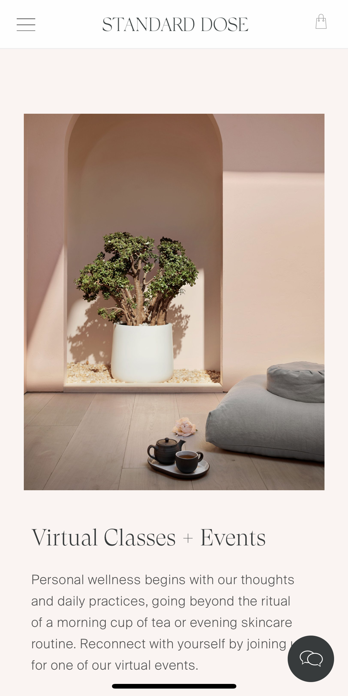
Pro-tip: slightly layering your typography and imagery is an elegant way to add visual interest.
Found by
Teal
#294948
Seashell
#faf5f2

Use italics to emphasize a headline, even better - use a pop of color!

Scroll around the shop section.
Check out that mobile view.

Don't be a square, try using a 3:4 aspect ratio for your images 📸.