Learning CSS Basics for Shopify
CSS stands for Cascading Style Sheets. This magical code is what styles your HTML content (aka images and text 🖌).
Remember our handy Developer Tools in Section 2 Level 1? Whenever we looked up the font size or background colors, that was CSS magic in the works! 🎩
Cool, so how much CSS do I need to complete the course?
Good question! Shopify is PACKED with native features (aka sections, blocks, and the Theme Editor), so you don’t have to write too much CSS.
Using the native features is a great way to ensure a smooth handoff to your client. When we review your work, we don’t evaluate how much CSS you have, we are primarily looking at colors, choice of photos/graphics/illustrations (if you have them), how you use native features, and… fonts.
Unfortunately, the font library in Shopify doesn’t include all the fun cool fonts that will really elevate your site. So everyone should learn how to upload custom fonts! We cover that in Section 2 Level 2, so watch those lessons for a step-by-step guide.
If you’re new to CSS, it's important to understand the fundamentals so that when you need to add custom code, you know what to look for. Take a gander below to understand how to read and write CSS.
And remember, CSS comprehension can up your design game, but they aren't necessary to complete the course. The rest is extra credit. 😉
01 — The Syntax: How to Read & Write CSS
CSS consists of two parts:
Selector: the HTML you want styled
Example: h1
In GLOWE, you might remember h1, div, and svg.
Starts and ends with curly ramen brackets {} 🍜
Property: what CSS style you want to use
Example: font-size
The Property is always followed by a colon :
Play around with it here.
Value: how you want it styled
Example: 20px
The value always ends with a semi-colon ;
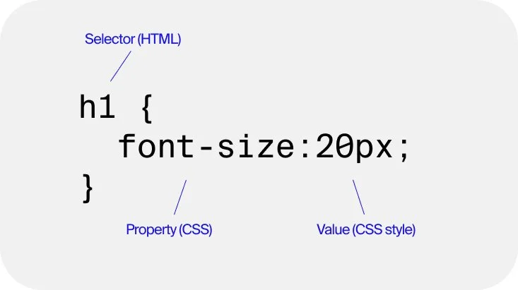
This is the syntax aka the rule you want to set.
Pro-Tip👇
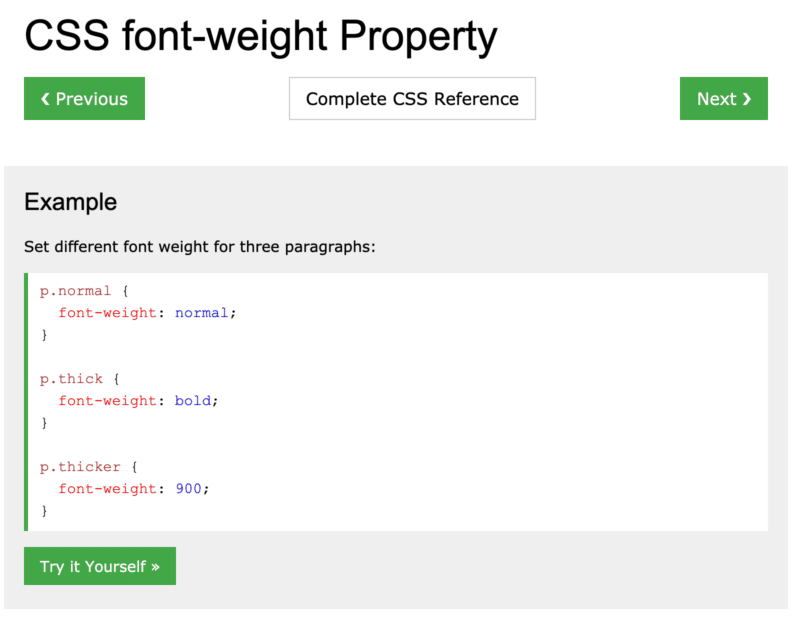
You are NOT expected to know every property or value of CSS! Most web designers AND developers are constantly learning and Googling for answers.
W3Schools is AWESOME for this! You'll usually find what you're looking for by opening a search browser and typing both your question followed by W3Schools.
EX: Search "Font weight property css w3schools" — here’s what you get 👉

02 — Selectors: .Classes vs #ID
As a Shopify designer, you’re always playing detective and trying to figure out how to style something — but you need to figure out what they named it.
This is why it’s very important to know how to identify a Class vs. an ID:
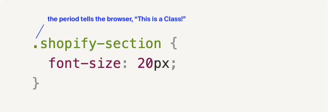
Classes (.)
Use a period .
When you want to style a group of elements
IDs (#)
Use a hashtag #
when you want to style one element
Shopify uses a ton of classes!
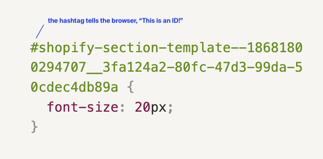
Shopify IDs usually have the words “shopify-section” in them
03 — See classes in the wild!
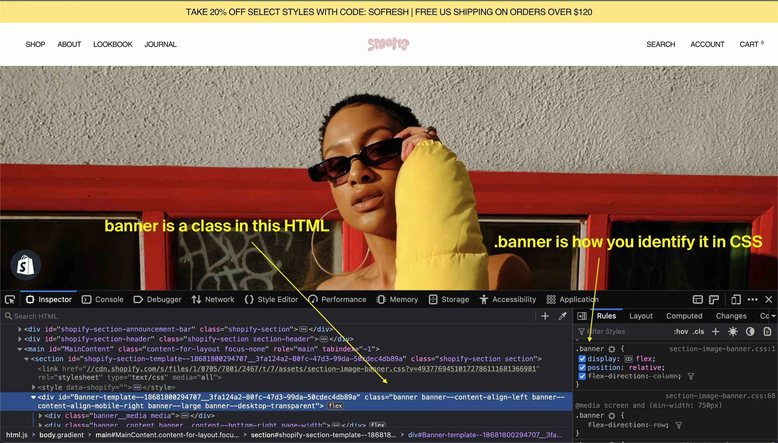
In Section 2, you were playing detective, but we were telling you what to look for. Now you can select any element in the webpage and then literally change the CSS style and value in the Developer Tools.
Class Example
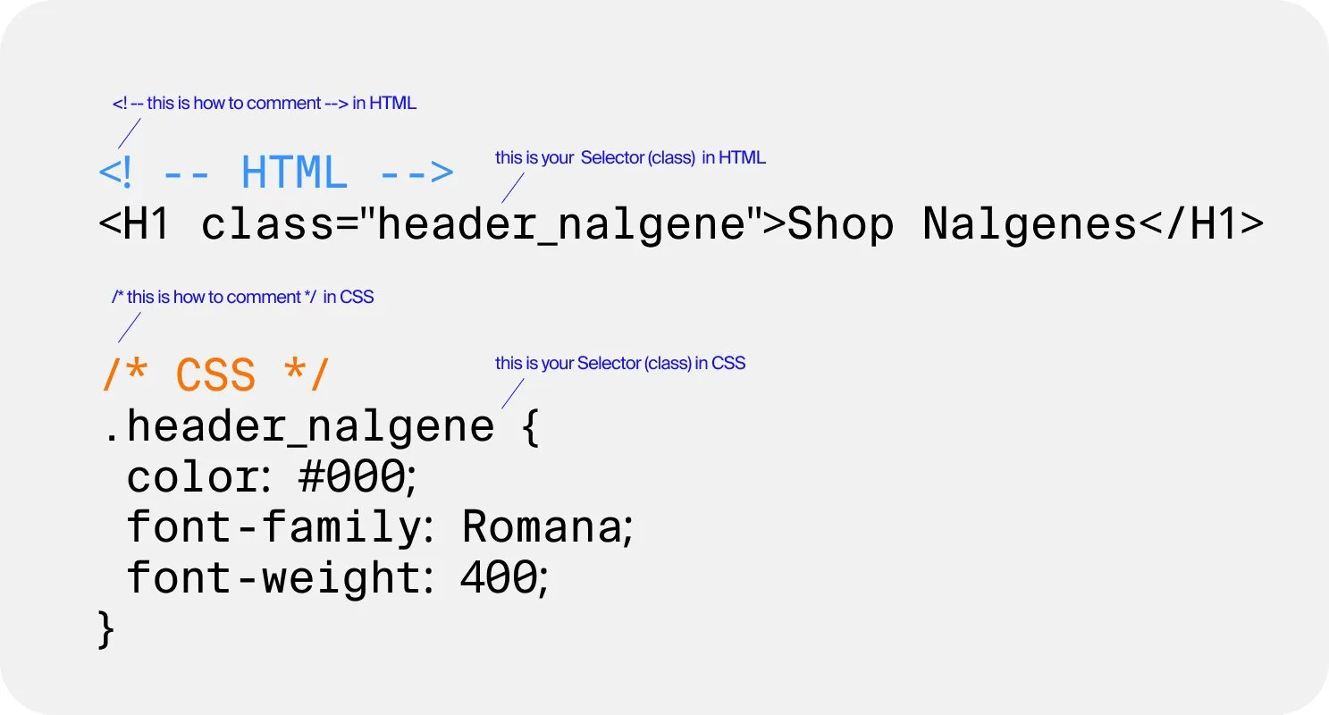
Let's say we want to create a blog page about the different ways to use our Nalgenes. 💦
We want every H1 header in the Nalgene shop to have these specifications:
Selector: header_nalgene
Declaration:
Color: #000 (or Black)
Font-family: Romana
Font-weight: 400
We’ll create an HTML class called “header_nalgene” to call out the CSS. Here's what this looks like in HTML and CSS 👉
ID Example
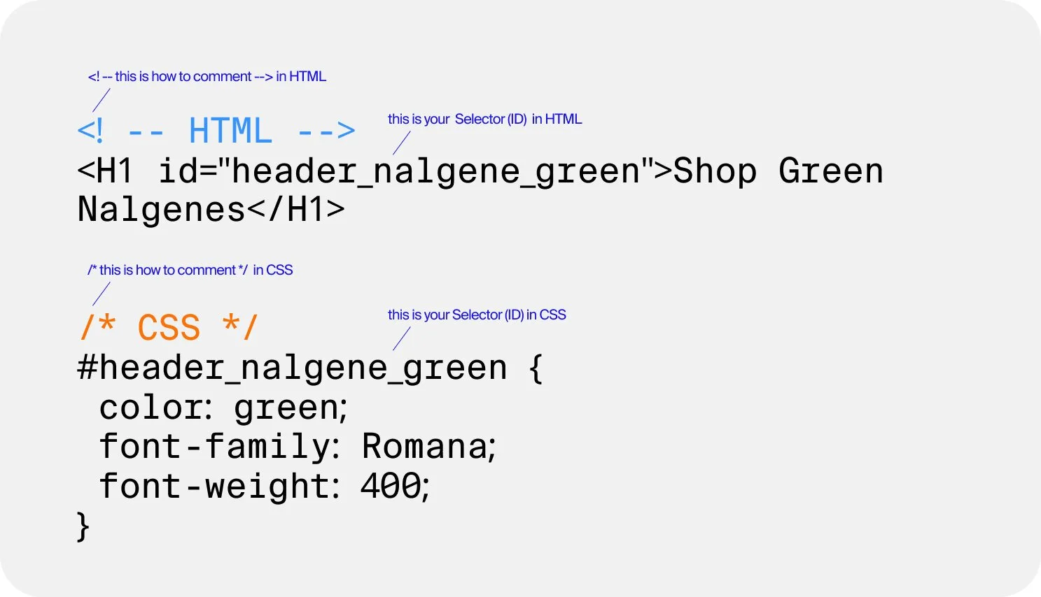
Great! Now what if I want one specific H1 header to be green, so it reaaally stands out? 💚IDs to the rescue!
Here’s my new specifications and what they’d look like now:
Selector: header_nalgene_green
Declaration:
Color: green
Font-family: Romana
Font-weight: 400
Which one should you use?
On Shopify, it’s best to reach for classes first. The random numbers on IDs can change when you update the Theme Editor, which means classes are the more sustainable (and classy) option!
04 — Media Queries and Breakpoints
What is a Media Query?
A media query is a CSS technique that uses the @media rule to include a block of CSS properties only if a certain condition is true. The most common condition is different browser widths, allowing you to add completely different styles across devices.
So when you want a CSS rule to only apply to Mobile or Desktop, for example, you would use a Media Query.
Media Queries wrap the CSS rule and there is always a second set of brackets.
What is a Breakpoint?
Breakpoints are customizable widths that determine how your responsive layout behaves across devices or viewport sizes.
In Shopify’s Dawn theme, the default breakpoints are 989px for Tablet and 749px for Mobile. This means that once your desktop browser size is at 989px, it switches from Desktop view to Tablet view (test it out yourself!), and when your browser size is 749px, it switches to Mobile view.
You can change the breakpoints if you edit all the
@mediaqueries in your theme’sbase.cssfile, but there are a lot of places to edit so this is not recommended for beginners.
For example, to code a CSS rule that only applies to Mobile in Shopify you would use the code below. It means that once a screen size gets to a maximum width of 749px or smaller this rule will then take place.
/*ONLY APPLIES TO MOBILE*/
@media screen and (max-width: 749px) {
   {
    /*ADD RULE HERE*/
   }
}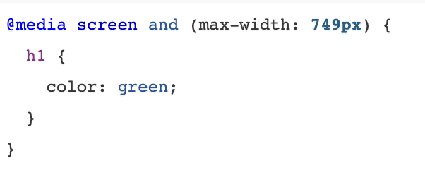
This rule is saying: only on a screen size of 749px or smaller (mobile) Heading 1 will be the color green.
For example, to code a CSS rule that only applies to Desktop on Shopify you would use the code below. It means that once a screen size gets to a minimum width of 750px or larger this rule will then take place.
/*ONLY APPLIES TO MOBILE*/
@media screen and (min-width: 750px) {
   {
    /*ADD RULE HERE*/
   }
}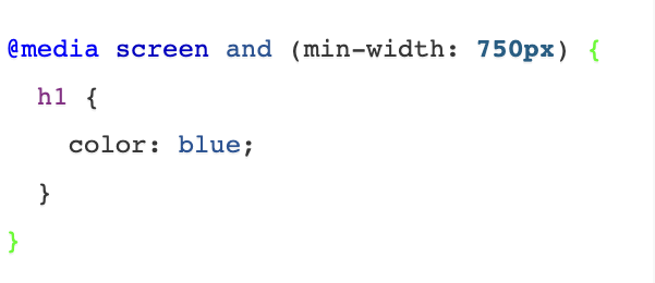
This rule is saying: only on a screen size of 750px or larger (tablet & desktop) Heading 1 will be the color blue.
Breakpoints can change depending on what screen size you are coding for (you don't have to stick with these values 😉).
You can read more about them here
More CSS Basics
CSS Introduction by W3Schools
Prefer something more interactive? Check out this nifty intro, with exercises you can do all in your browser.
CSS Basics Playlist by DevTips
Watch all 8 videos and get ready to be edu-tained! Each YouTube video is under 10-minutes and sums up the most important aspects of CSS to help you get started.
Mozilla CSS Reference
One of the best guides out there on every single CSS property and selector you could ever use, written by the people who develop Firefox browser (and work on developing HTML itself). This is a very official resource.
CSS Tricks Alamanc
This is another encyclopedic resource on every CSS property and selector ever, written by Chris Coyier who’s been writing tutorials on CSS pretty much since CSS started in the 00’s.