7.1 York Template Instructions
YORK —
Portfolio 7.1
View the Website (pw: brineintopedro)

Welcome!
While Squarespace is supporting their 7.0 version indefinitely; they are also starting to roll-out 7.1, a new version which is COMPLETELY different from the previous version. See the changes below 👀:
One template for all: While the landing page for templates show several examples of websites using Squarespace 7.1, they are essentially one template and structure.
Add sections to Collection Items: Users can add sections to blog posts and other collection items.
Global Design Settings: The design settings are simplified, but restricting compared to the previous version.
No more indexes: Squarespace got rid of movable indexes and index galleries! They are now called sections.
No import/export capability: 7.1 does’t support importing and exporting content.
No switching between versions: You can’t switch from a 7.0 template to a 7.1 template and vice versa. Make sure you are aware of both versions’ capabilities before designing!
01. Getting Started
Start your timer! ⏱
Open York 7.1 Reference Website (pw: brineintopedro) in one tab.
Start a new 7.1 trial site here. Choose any template!
Download all images from York 7.1 using Image Downloader Chrome Extension (or similar) and rename them so it's SEO friendly. For example: york-product-1.jpg
Tip: On a mac, you can go to the Finder, select a group of images, right click and then rename. It’s uh-mazing!To stay organized, create separate folders for each page so it’s easier to locate the images later.
02. Global Design Settings
Colors
The design options for 7.1 has become simplified and templated. You can define 5 Colors which gives you 10 Themes that you can then further customize.
Go to Design > Site Styles > Colors
Click Edit on Edit Palette
Change the color circles under Palette Editor to the following:
Lightest: #F8D3D3
Light: #FFFFFF
Bright: #F8D3D3
Dark: #222222
Darkest: #222222
Fonts
For the Headings, we’ll be using a trial version of Maison Neue Extended Book by Milieu Grotesque. Please purchase the fonts if you intend to use them on any work. They are designers too! Otherwise, sign up for the trial font on their website.
Convert fonts
When buying fonts, purchase the .otf and .woff font formats. When you are buying web licenses for fonts, these are both typically included. What about the other font formats? You won’t need them! Here’s the difference between Font Formats and Browser Support.
Since these are trial fonts, you’ll need to convert the OTF to WOFF. I use Online Font Converter.
Upload and install custom font
📹Watch the video to see how to upload MaisonNeue-Extended-Book and add CSS, or follow the Install Custom Fonts instructions in resources.
Go to Design > Custom CSS
Click Open in New Window
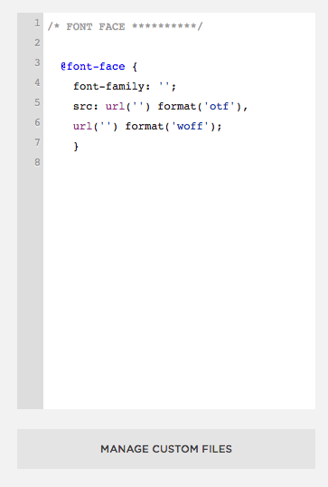
Copy + paste the following CSS:
@font-face {
  font-family: '';
  src: url('') format('otf'),
       url('') format('woff');
}
Click Manage Custom Files at the bottom of the window
Drag and drop the MaisonNeue-Extended-Book.woff file, or click Add images or fonts and add file
Add the name of the font-family MaisonNeue-Extended-Book in between ‘ ‘
Add your cursor in between the url ‘ ‘ for woff and click the MaisonNeue-Extended-Book.woff file you just added
It should look like this:
@font-face {
  font-family: 'MaisonNeue-Extended-Book';
  src: url('https://static1.squarespace.com/static/5b620f2d5b409be804907c50/t/5baf3083f4e1fcc6feaccc12/1538207875934/MaisonNeueExtendedTRIAL-Book.otf')
      format('otf'),
    url('https://static1.squarespace.com/static/5b620f2d5b409be804907c50/t/5baf3089c8302589be87ebda/1538207881973/MaisonNeueExtendedTRIAL-Book.woff')
      format('woff');
}
Next, copy + paste the following CSS
Add the font-family MaisonNeue-Extended-Book in between ‘ ‘
/* FONTS **********/
h1,
h2,
h3,
h4,
.header-title-text,
.header-nav-item,
.sqs-button-element--primary {
  font-family: 'MaisonNeue-Extended-Book' !important;
}
h1,
h3 {
  text-transform: uppercase;
}
Click Save and close window
Tip: Don’t see your custom font? Try refreshing your browser ✨
Set Font Styles
Go to Edit > Site Styles > Fonts
👀 Peep the images to see what styles to set for Headings and Paragraphs
**NOTE: Because we are using a custom font for Headings, these will just dictate the size, line height and letter spacing
Site Spacing
Design > Site Styles > Spacing
Page Width: 1500 (max)
Site Margin: 10vw
Developer Tool
Remember the shortcut for Developer Tool? You'll be using this a lot during this exercise so write it down!
⌘Command Shift C
Use the developer tool to find which fonts are being used. Grab a screenshot of each one so you can reference them later. Add them to your nifty asset folder for reference. Tip: you can press the SPACEBAR to preview the image from the finder so you don’t have to open it.
H1
H2
H3
H4
Body Text
Once you’ve got all the font styles, create a Style Guide.
Can’t find the font in Squarespace? See Adding Custom Font section below.
02. Header
Main Navigation
Go to Home > Pages
Under Main Navigation, add a Portfolio and name it “Work”
Under Not Linked, add a Blank Page and name it “About”
📹Watch the video to see how to style and customizeEdit > Edit Site Header > Desktop > Header Layout
Choose the layout with the logo in the middle, navigation on the left, and button on the right
Go back to the Global settings of Site Header
Under Site Title & Logo, add in your site name
Under Elements, toggle Button and label it About
Custom Font Settings
Go to Edit >Site Styles > Fonts
At the very bottom, click Assign Styles
👀 Reference the images to set your styles for the Site Title, Site Navigation and Header Button
Custom CSS: Header
Go to Design > Custom CSS
Add the following Custom CSS
//HEADER
//remove the background on the header button
.header-actions .btn {
    background-color:transparent;
    color:#222;
    font-weight:500;
}

//make navigation green on hover
.header-actions .btn:hover {
    color:green !important;
}
.header-nav-item a:hover {
    color:green !important;
}

//remove bottom border on active pages
body:not(.tweak-transparent-header) .header-nav-item--active a   {
    background-size: 0px 0px;
}
03. Rotated Side Text
Go to Settings > Advanced > Code Injections
👀 Similar to the image on the right, copy + paste the following in the Footer section:
<div class="sidetext-left">
    <h3>This is — <a href="https://www.google.com" target="_blank">the left side text</a></h3>
</div>
<div class="sidetext-right">
    <h3>This is — <a href="https://www.google.com" target="_blank">the right side text</a></h3>
</div>
Go to Design > Custom CSS
Copy + paste the following CSS:
//SIDEWAY TEXT .sidetext-left h3, .sidetext-right h3 { } .sidetext-left, .sidetext-right { z-index:999; position: fixed; bottom: 40%; height: 1.5em; margin: auto; } .sidetext-left { left: 25px; transform-origin: 0 50%; transform-origin: 0 50%; transform-origin: 0 50%; transform-origin: 0 50%; transform-origin: 0 50%; transform: rotate(-90deg) translate(-50%, 50%); transform: rotate(-90deg) translate(-50%, 50%); transform: rotate(-90deg) translate(-50%, 50%); transform: rotate(-90deg) translate(-50%, 50%); transform: rotate(-90deg) translate(-50%, 50%); } .sidetext-right { right: 25px; transform-origin: 100% 50%; transform-origin: 100% 50%; transform-origin: 100% 50%; transform-origin: 100% 50%; transform-origin: 100% 50%; transform: rotate(90deg) translate(50%, 50%); transform: rotate(90deg) translate(50%, 50%); transform: rotate(90deg) translate(50%, 50%); transform: rotate(90deg) translate(50%, 50%); transform: rotate(90deg) translate(50%, 50%); } @media only screen and (max-width: 1000px) { .sidetext-left, .sidetext-right { display: none; } }
04. Footer
📹Watch the video to see how to edit the footer
Add spacer blocks, an image block, text block and newsletter block
Hover over the footer section and click the icon to edit styles
Under Content Alignment, select the icon for center alignment
Custom CSS: Simple Newsletter Block
Go to Design > Custom CSS
Copy + paste the following CSS:
/* NEWSLETTER **********/ .newsletter-block .newsletter-form-body { padding: 0px; border-bottom: 1px solid #222; max-width: 300px; margin: 0 auto; /* remove if you don't want it centered and change the alignment to left or right */ } .newsletter-block .newsletter-form-field-wrapper { padding: 0px; min-width: 190px; } .newsletter-block .newsletter-form-field-element { border: none; padding: 0px; background: #f8d3d3 !important; background-color: #f8d3d3 !important; font-size: 16px; font-family: 'MaisonNeue-Extended-Book'; /* if you want to change the input text */ } .newsletter-block .newsletter-form-button { padding: 0em; font-family: inherit; /* if you want to change the input text */ text-transform: lowercase; transition: all ease-in-out 200ms; transition: all ease-in-out 200ms; transition: all ease-in-out 200ms; transition: all ease-in-out 200ms; transition: all ease-in-out 200ms; } .newsletter-block .newsletter-form-button:hover { color: green; } body:not(.button-style-default) .newsletter-form-button { background-color:transparent; padding:0 !important; color:#222; font-weight:400; text-transform:none; } .newsletter-block .newsletter-form-fields-wrapper { margin:0em !important; } .newsletter-block .newsletter-form-button-wrapper { margin:0em 0em !important; }
To remove the underline on links, add the below CSS:
//remove underline
.sqs-block-html a, .image-title-wrapper a, .image-subtitle-wrapper a, .sqs-image-caption a, .sqs-block-newsletter a {
  background-size:0px;
}
To add hover effects to links, add the below CSS:
//add hover effects to links h1 a, h2 a, h3 a, p a { transition: all ease-in-out 200ms; transition: all ease-in-out 200ms; transition: all ease-in-out 200ms; transition: all ease-in-out 200ms; transition: all ease-in-out 200ms; } h1 a:hover, h2 a:hover, h3 a:hover, p a:hover { text-decoration: none; color: green; }
05. Work Page
📹Watch the video to see how to edit the Work page
Go to Home > Pages and select Portfolio
Delete all placeholder content
Add two blank projects
Enter the Project Titles and Thumbnails and save
Click Edit on the top left
Copy + paste the text from the York template
Scroll down to the section with the 2 images you added
Click the Edit Styles Icon to change the settings of the portfolio gallery
Layout: Grid: Overlay
Columns: 2
Text Placement: Bottom Left
Show Text: After Hover
👀Look at the GIF to see how to set this page as your homepage
Custom CSS: Remove Overlay Color, Customize Title, and Add Image Animation
Go to Design > Custom CSS
Copy + paste the following CSS:
//PORTFOLIO //Remove overlay color .no-touch .tweak-portfolio-grid-overlay-show-text-after-hover .portfolio-grid-overlay .grid-item:hover .portfolio-overlay { opacity: 0 !important; } // Define Font of Portfolio Title .portfolio-grid-overlay .grid-item .portfolio-text .portfolio-title { color:#fff; font-weight:500; font-size:40px; text-align:right; } // Add border and animation to portfolio image .portfolio-grid-overlay .grid-item .grid-image { border: 1px solid #222; transform: scale(.90,.90); transform: scale(.90,.90); transform: scale(.90,.90); transform: scale(.90,.90); transform: scale(.90,.90); transition:transform .5s cubic-bezier(.23,1,.32,1); transition:transform .5s cubic-bezier(.23,1,.32,1); transition:transform .5s cubic-bezier(.23,1,.32,1); transition:transform .5s cubic-bezier(.23,1,.32,1), transform .5s cubic-bezier(.23,1,.32,1),transform .5s cubic-bezier(.23,1,.32,1),transform .5s cubic-bezier(.23,1,.32,1); } .portfolio-grid-overlay .grid-item:hover .grid-image { transform: scale(1); transform: scale(1); transform: scale(1); transform: scale(1); transform: scale(1); }
06. Project Pages
I’m OK and Winners
📹Watch the video to see how to edit the I’m OK project page
Click Edit on the top left corner
In the top section:
Copy + paste text from the York template and see below styles:
Project Title: Heading 1
Project Description: Heading 4
Under Section Styles, choose the SMALL content width.
Add another section below:
Add image blocks
For the image blocks with text on the side:
Go to the Design tab and select Card
Change the image position accordingly
Follow the same steps for the Winners project page
Custom CSS: Font Settings
Go to Design > Custom CSS
Copy + paste the following CSS to change the font settings:
//project pages font settings
  .view-item {
  h1 {
    font-size:48px;
    text-transform:none;
  }
    h4 {
      font-size:18px;
      line-height:1.6em;
    }

    p {
      font-size:16px;
      line-height:1.6em;
    }

    a {
      text-decoration: none !important;
    }

    .page-section:not(.content-collection):not(.gallery-section) > .content-wrapper


}
07. About Page
👀Look at the GIF to see how to build the About page
Go to the About page and click Edit
Click the + and add a new blank section
Click the Section Styles icon
Under Format
Section Height: Large
Content Width: Large
Click the background tab
Add the cloud gif
Add a text block and type “About”
Change the style to Heading 1
Add another blank section below
Add the rest of the text blocks, image block and button block
Change the text styles accordingly
👀Look at the Image to see how to link the About page to the Navigation
Hover over the header
Click Edit Site Header
Click Elements
Type “/about” below the word About and select the About page that pops up
Custom CSS: Work With Me Button
Make sure the “Work With Me” button is a Medium button
Go to Design > Custom CSS
Copy + paste the following CSS to add the hover box shadow effect:
.sqs-block-button-element--medium {
  -webkit-transition: all ease-in-out 200ms;
    -moz-transition: all ease-in-out 200ms;
    -ms-transition: all ease-in-out 200ms;
    -o-transition: all ease-in-out 200ms;
    transition: all ease-in-out 200ms;
}

.sqs-block-button-element--medium:hover {
  box-shadow: 10px 10px rgba(0, 0, 0, 0.2);
  opacity: 1 !important;
}

.image-caption a {
  text-decoration: none;
}
08. Mobile
Squarespace 7.1 has limited built-in option to style the mobile view so you’ll be adding some Custom CSS.
Go to Design > Custom CSS
Copy + paste the following CSS:
//Mobile
@media screen and (max-width:991px) {
.header-menu


.header-menu-nav-folder-content


.header-menu-nav {
 margin-top:100px;
    height: 100px;
}

.header-menu-nav-item a {
   font-family: 'MaisonNeue-Extended-Book' !important;
   font-size:6.5vmin;
}
.sqs-block-button-element, .image-button a, .header-actions .btn, .header-menu-cta a {
   font-family: 'MaisonNeue-Extended-Book' !important;
  background-color:transparent !important;
  color:#000  !important;
  font-size:6.5vmin !important;
}

 .header-menu-cta a {
   margin-top: -4vw !important;
  }
}