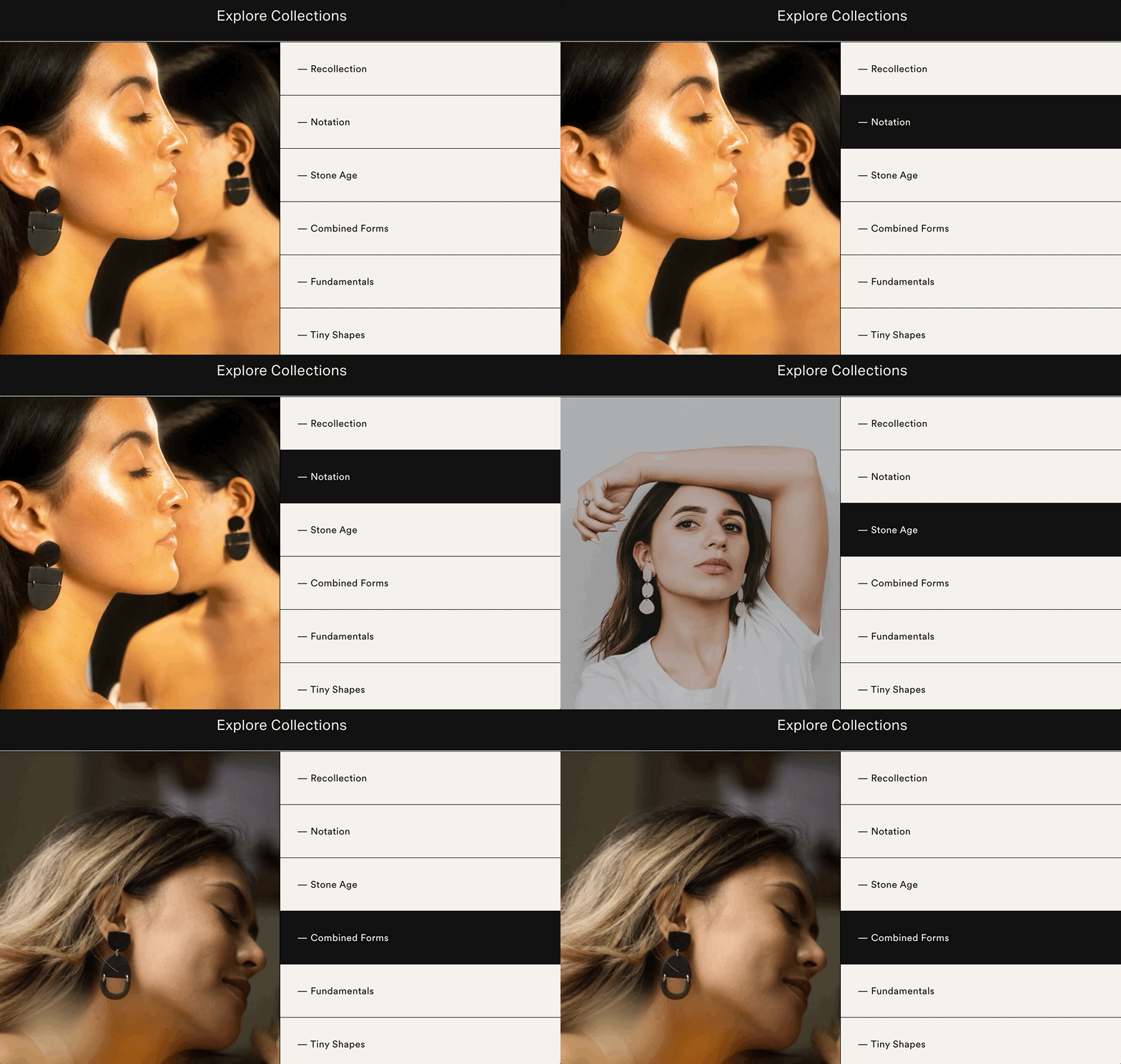
Uh-Huh
Why we love
this site.
Uh-Huh brings on all the serene vibes, starting with that slowly warping hero image on the homepage (hint: that’s a Squarespace feature!). The layout is grid-like but still has soft elements like organic shapes and plenty of space. Like the site’s handmade jewelry, you can tell a lot of love and care went into crafting it.
This site is designed by the company’s founder, Jaydee Devine. She is currently in our Squarespace Design Course — this is her Level 3 Custom Site!
Designed by:
Jaydee Devine,
Squarespace Design Course Student
Platform
Want a discount? Learn more↗
Fonts Used
Circular by Lineto
Aktiv Grotesk by Dalton Maag
Colors Used
Oat
#F2F0EA
Coal
#131313


