Filter Bubble CSS
Customize collection page filters with this code snippet!
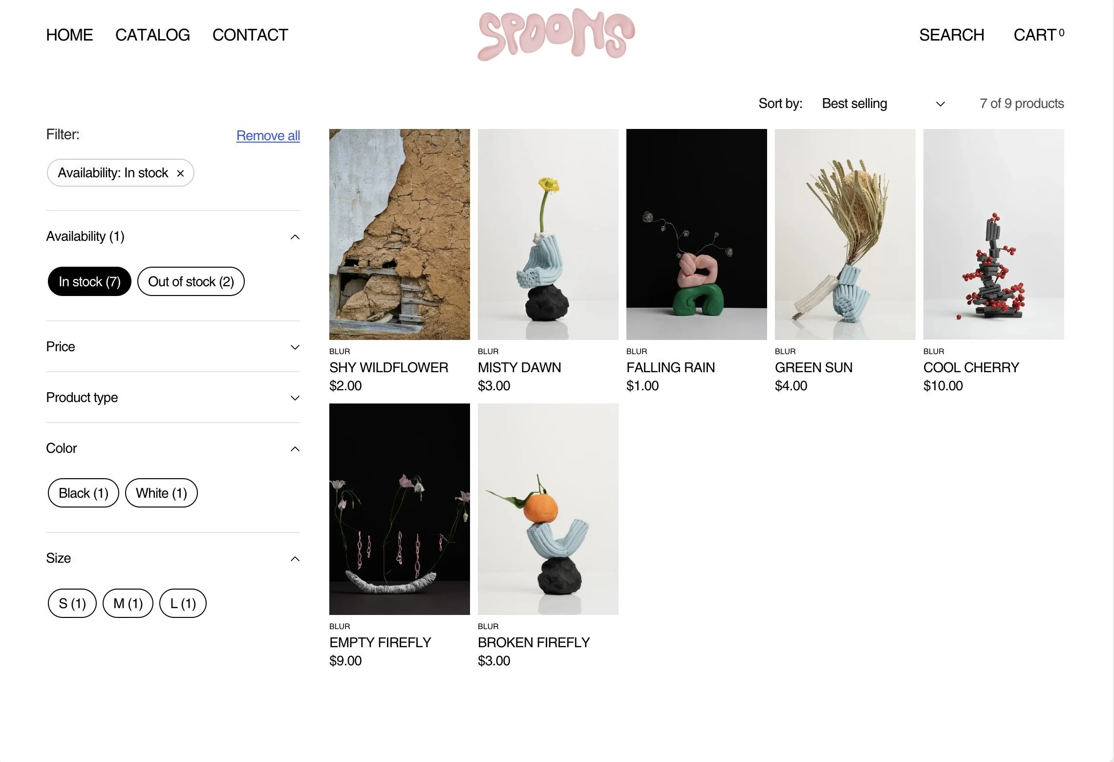
What It’s For
Change the default Dawn styling for filters like Color, Size, and Product Type. Create filter bubbles that are a different color when selected. These filters show up on the Collection template and Search results template.
How to Use
Theme Setup
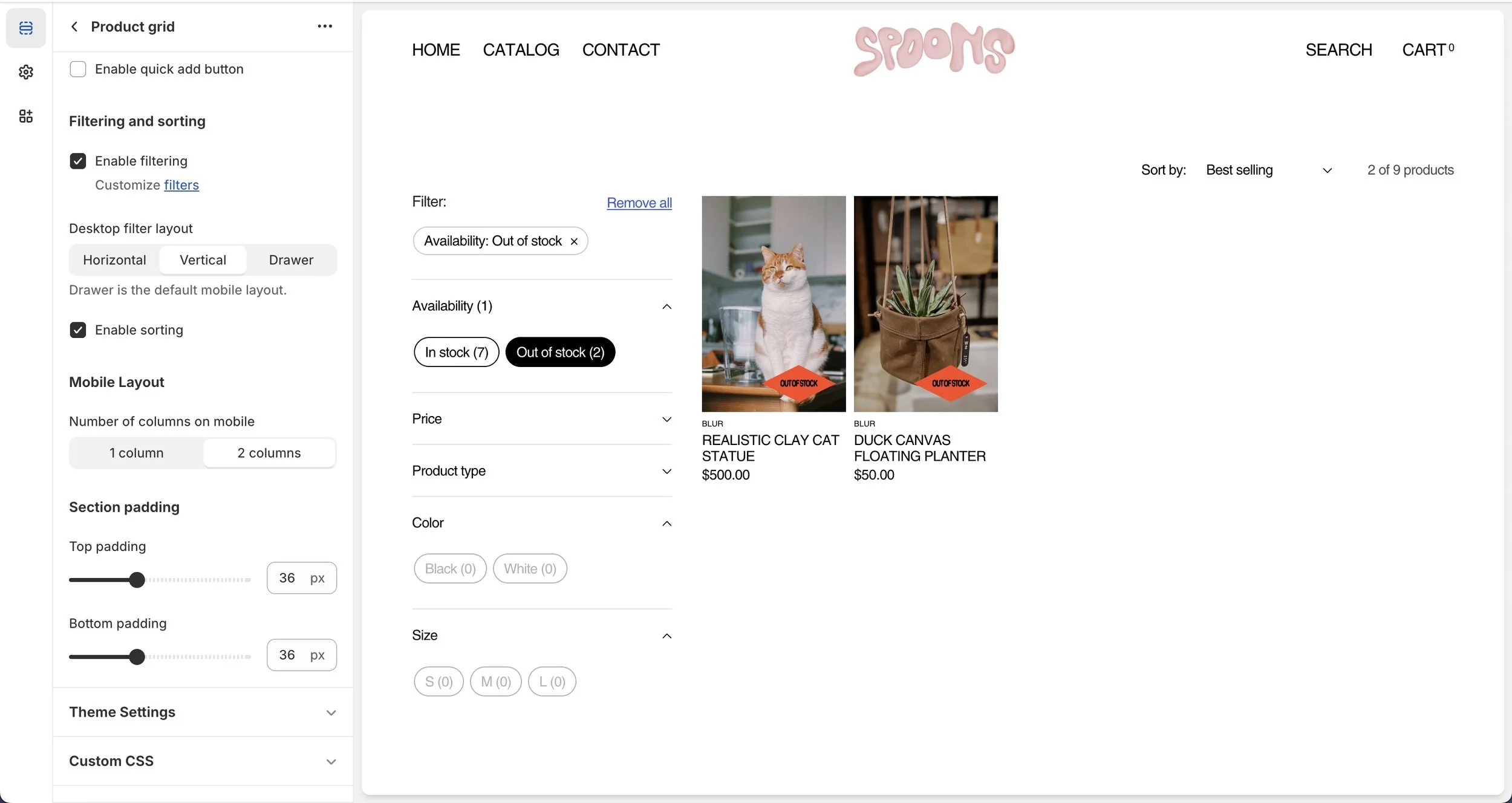
Open the Theme Editor in
Online Store > Themes > CustomizeNavigate to the Collections template under
Collections > Default CollectionSelect the Product Grid Section
Make sure “Desktop filter layout” is set to “Vertical”
Repeat for
Search > Search ResultsTemplate
CSS Customization
Open the Code Editor by clicking …
> Edit CodeNavigate to
assets/components-facets.cssAt the bottom of the file, copy and paste this CSS and save:
/* Filter bubbles in vertical filter layout */

fieldset.facets-wrap-vertical ul {

  display: flex;

  flex-flow: wrap;

  gap: 6px;

}

.facet-checkbox {

  padding: 0;

}

.facet-checkbox svg {

  display: none;

}

/* Inactive filter bubble styling */

.facet-checkbox>input[type='checkbox']~span[aria-hidden='true'] {

  border: 1px solid black;

  color: black;

  padding: 5px 10px;

  border-radius: 50px;

}

/* Active filter bubble styling */

.facet-checkbox>input[type='checkbox']:checked~span[aria-hidden='true'] {

  color: white;

  background: black;

}

/* Unavailable filter bubble styling */

.facet-checkbox.facet-checkbox--disabled>input[type='checkbox']~span[aria-hidden='true'] {

  opacity: .3;

}
Change styling of the filter bubbles for inactive, active, and unavailable filter bubble styling by changing the CSS styles above.
For help with CSS, check out Learning CSS Basics for Shopify and Coding for Beginners.