Level Three
Building 3 Websites


Congrats on reaching Level 3!

This is the part where you’re going to flex the crap out of your design brain. There’s a lot of information we want to share with you so we created this guide.

💖 The ilovecreatives Team 💖


level-3-guide-bg.jpg


Level 3 Guide
Assignment Overview

Table of Contents

Level 3 Overview
Website 3.1: Halcyon
Website 3.2: Inspo
Website 3.3: Custom


black.png

Level 3 Overview

In this level, you'll be creating 3 websites. We recommend that you complete each one before moving on to the next. Oh yeah, there's some serious gamification. 🎮

Each level builds on top of the other, so put your Bob the Builder hat on and keep up that positive attitude! This level can take students 1-3+ months but the most important thing is putting in consistent work. We'll share lots of accountability tips and resources along the way (check your email 📬).

Start with a 7.1 Essex template for your first Level 3 website, Halcyon.

💻 Website 3.1 Halcyon

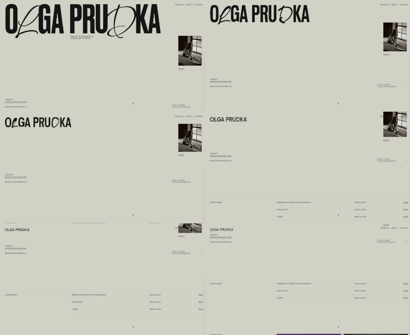
You learned 7.0 with Brine into Pedro, now you are going to learn 7.1 with Halcyon. This one is twice as hard as Brine Into Pedro, it uses certain Squarespace features in new ways and has a lot of CSS.

Halcyon Template

Assignment Overview

Level 3.1’s assignment is to recreate the Halcyon template designed by Puno. Instead of a video format, the instructions are written out (like most forums and posts), and you’ll be learning how to use certain Squarespace features in new ways and how to add custom CSS.

Objectives

  • Learn Squarespace version 7.1

  • Learn how to follow along with written instructions (similar to posts and forums!)

  • Add custom fonts!

  • Develop a basic understanding of CSS and when to use it

Getting Started

Make sure you've started a 7.1 trial site for Halcyon. Once you have that new trial site, open the Halcyon template in one tab, and the template instructions in another. The password for both is backandforth. Both links are below:

Halcyon template:
https://halcyon-fe.squarespace.com/


Grading

We grade Halcyon similarly to Level 1's Brine into Pedro. Your fonts, images, layout, navigation, content AND hover effects should all be 90% correct to pass. That means we even check that your letter spacing is right on allllll your fonts 🤯 Take your time, and double-check the Halcyon instructions to make sure you've worked through all the steps! When you pass, you’ll be notified in the course progress section in the portal.

Ready to Submit?

If you feel ready-ready, change your site visibility to password-protected (pw: backandforth) and submit your site in the portal. Give us a few days to review and send feedback. As you wait, feel free to work on 3.2.


🔥 Hot Tips

  1. It’s OK if you haven’t started, just start.

  2. Focus on one mini-goal with a very specific timeline. Ex: Finish one entire section before 11AM this Tuesday.

  3. Use the 2 Hour Super Productive Time pomodoro technique — we’ve got a video for you.

  4. Vent on #pep-talk channel and find an accountability buddy.

  5. If all else, take a deep breath and dance to our hit single "Calm Down."

  6. Oooooo ~ are you ready to submit your Halcyon 3.1 site? Hold on their cowperson! Remember Level One when you got your website reviewed by an awesome TA?

    First, get a GUUUD night's rest 😴 before submitting. Spend a work sesh reviewing your work, line by line, page by page. There's a real person reviewing each detail and it takes time! So, be respectful of your TAs time.

giphy-1.gif

📕 Level 3.1 Resources

Below are some resources that might be helpful for this assignment. To go to the main Resource Library page, click here.

🍪 Suggested Cookie Rewards

Image+2020-06-30+at+7.42.08+PM.png

💻 Website 3.2 Inspo Site

Excited to move on to Level 3.2 — Recreate an inspo website?! I see you kind of nodding your head! Remake a site you put in your #intro or any other site that suits your fancy. Your goal is you to desconstruct that site’s “brand book”.


Assignment Overview

Level 3.2’s assignment is to remake a site you're inspired by!

Brand books don’t have crazy animation! They’re static images, but the ~vibe~ is there. I’ve designed over 100 websites and I promise you... the way you use typography, photographs, colors, and layout is WAY more important than flashy CSS.

If your Inspo site has any complicated animation or CSS involved, we don't expect you to recreate it... unless you're up for the challenge! Get it as CLOSE as possible, but if it gets too complicated, then design another alternative using the tools you’ve got with the site’s brand book in mind. The most important thing is to think strategically about which site you end up recreating — read on!

Objectives:

  • Dive deeper into developer tools

  • Learn how to integrate more custom CSS

  • Level up your problem-solving skills

Getting Started

You can start with a 7.0 or 7.1 trial site for this assignment. Once you have that new trial site, you can start recreating your inspo site! Can’t remember which websites you shared? Check your email for the subject line Your Squarespace Student Info Submission which should have a copy of your answers. If you can’t find that, let us know in the #level3 channel!

Slack #intros channel

#intros channel

Choosing Your Inspo Site

Picking which site to recreate can be tough, and your aesthetics might’ve changed since you posted in #intros. The goal of this assignment is to choose a site that you wish you designed, so ask yourself: do these sentences resonate with you and/or the website you picked?

  • "I can actually see myself wanting to work on this..."

  • "This site has something I really want to learn..." Maybe you want to build shops, blogs, or learn cool animation tricks. Keep in mind which skills you want to develop and use this opportunity to practice & get feedback as you build them!

  • "This site really represents my goals for future web projects."

  • "Yes. I could stick with this site. Even when the going gets tough."


Grading

The layout, fonts, colors, photos, and copy should be the same, but your recreation doesn’t need to be pixel perfect. We're looking for a very close replica doable within Squarespace. Animation and functionality outside of Squarespace is a bonus as we know not all of the sites you picked are built on Squarespace.

Ready to Submit?

⚠️ Don’t submit just yet! Puno will be grading 3.2 and 3.3 together, so you’ll need to wait until you’re finished with 3.3 Custom Site.

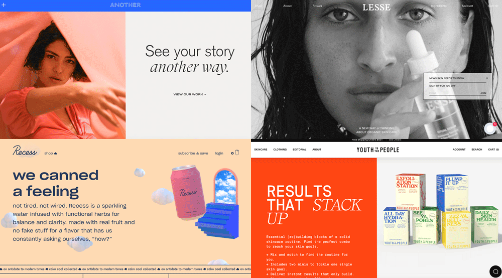
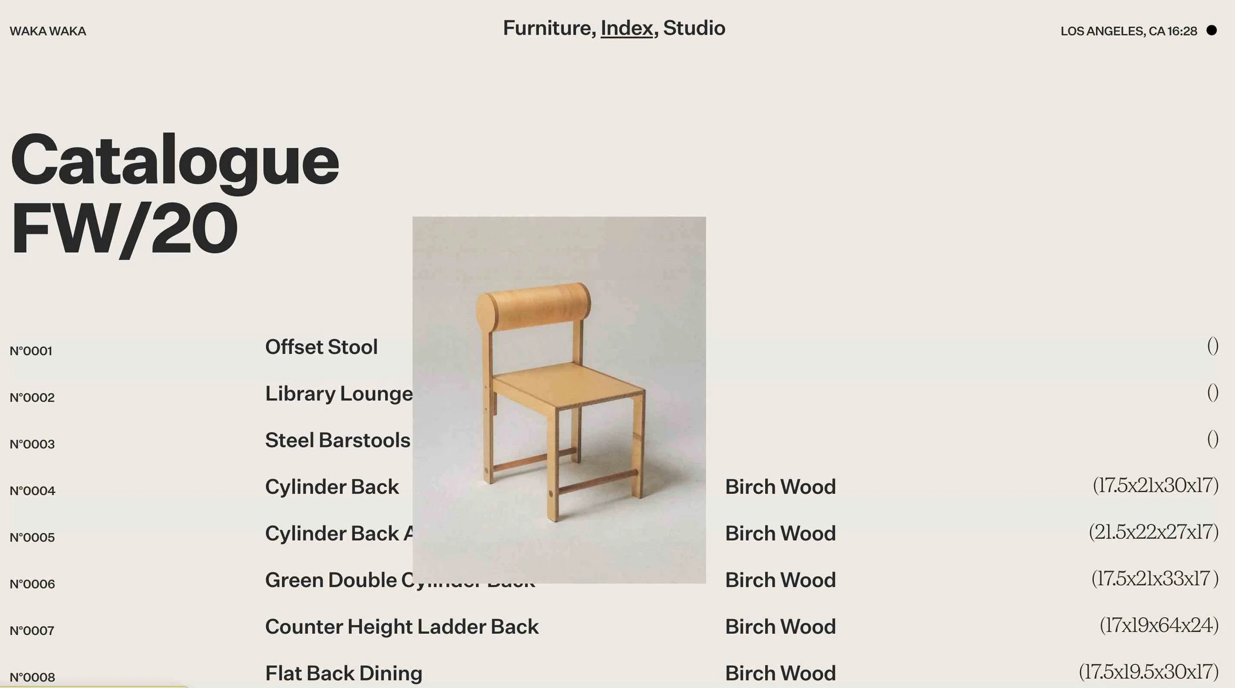
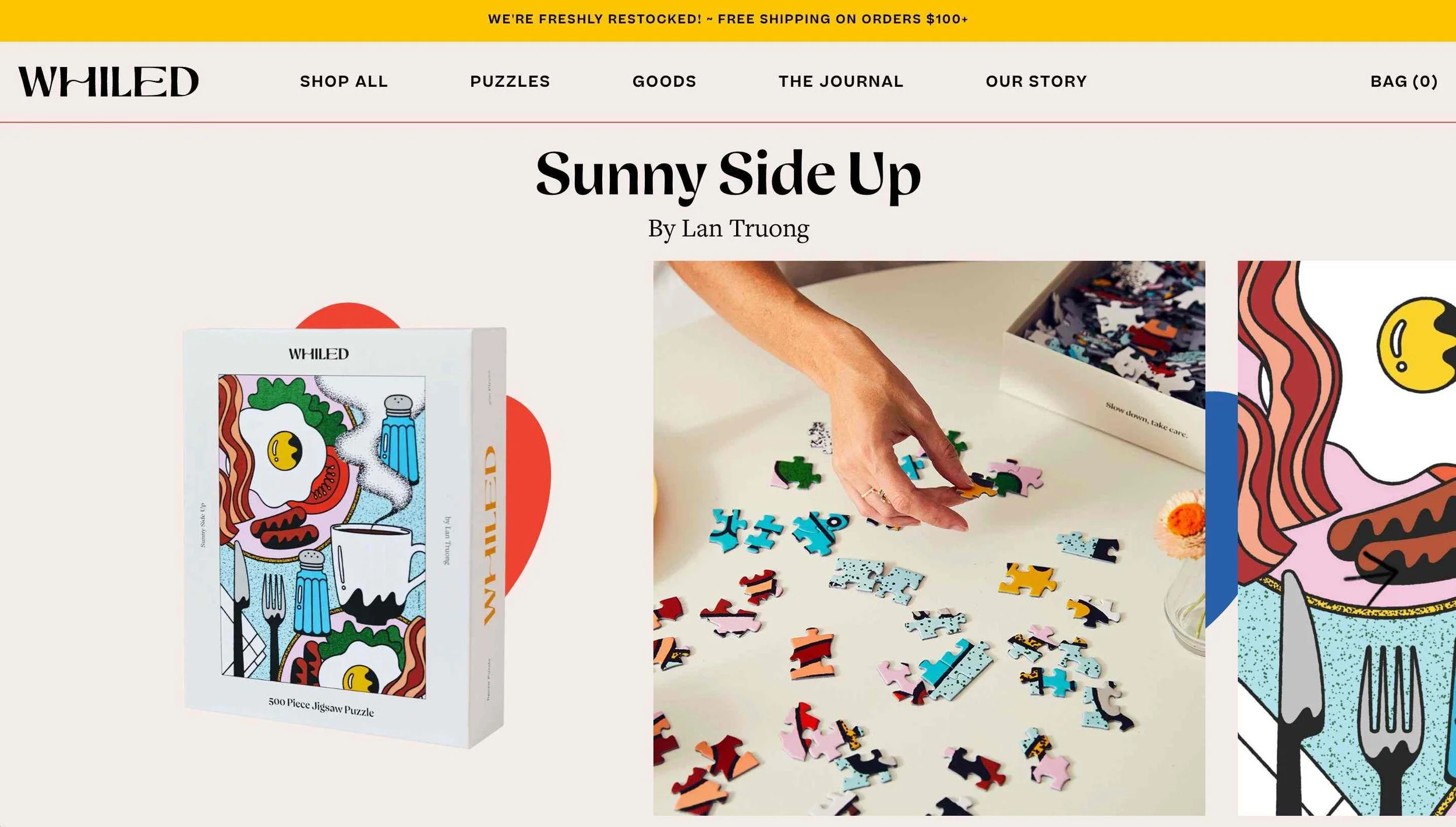
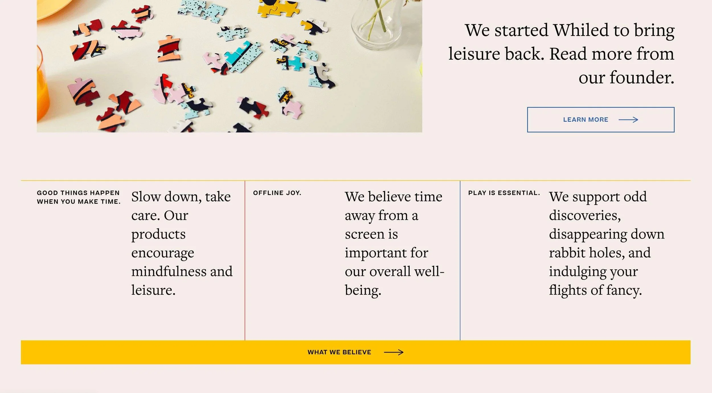
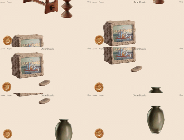
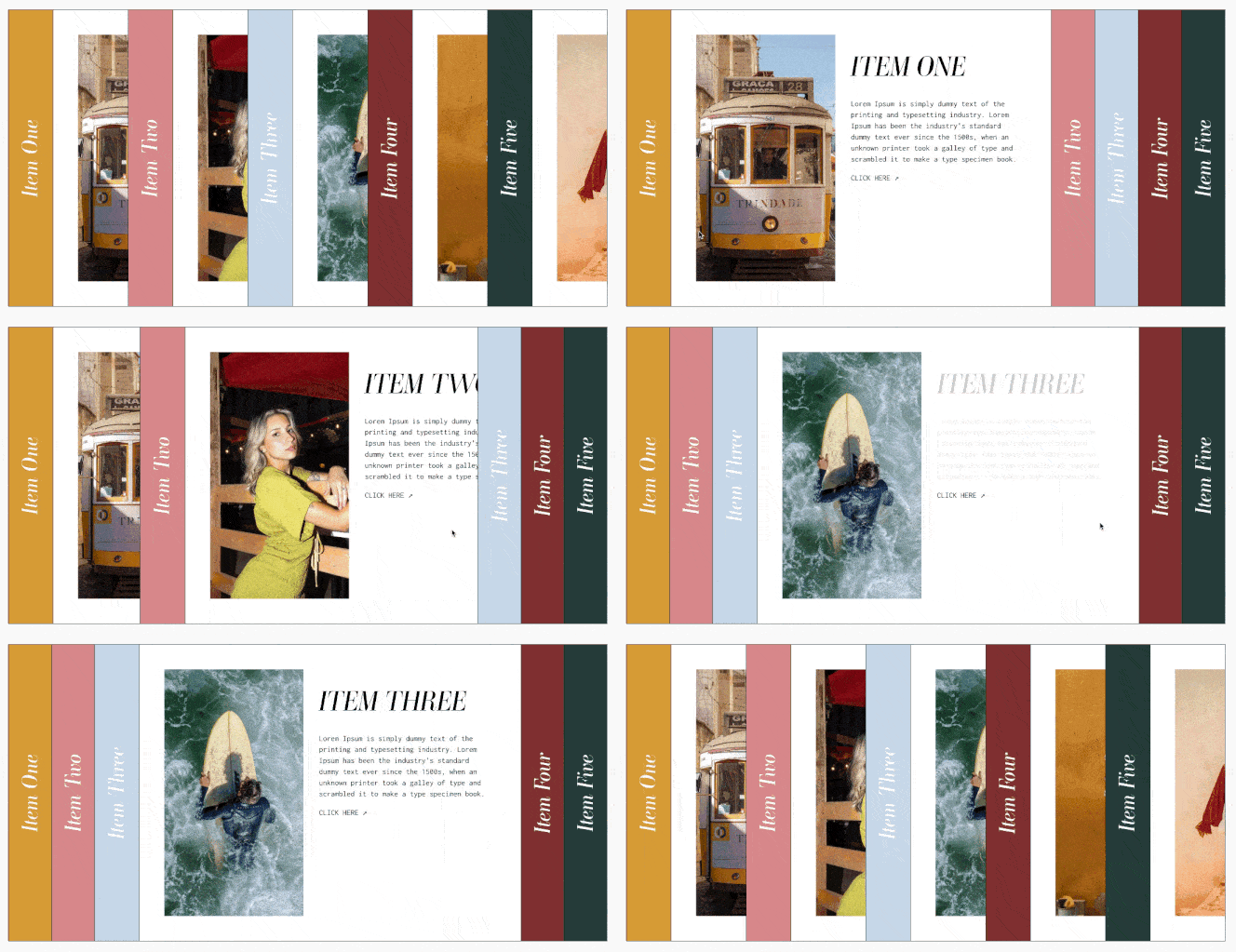
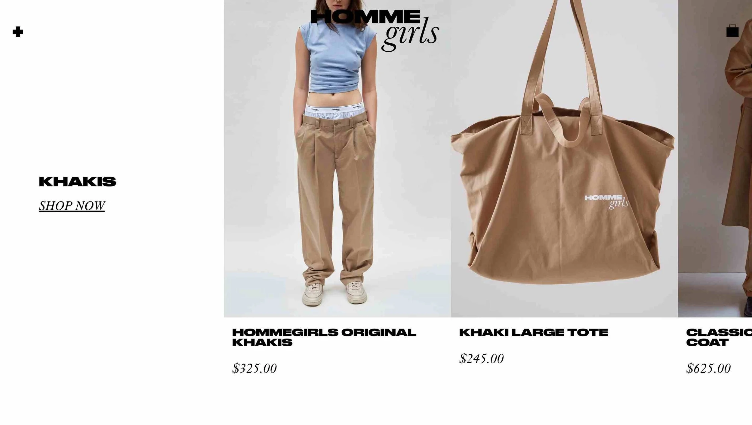
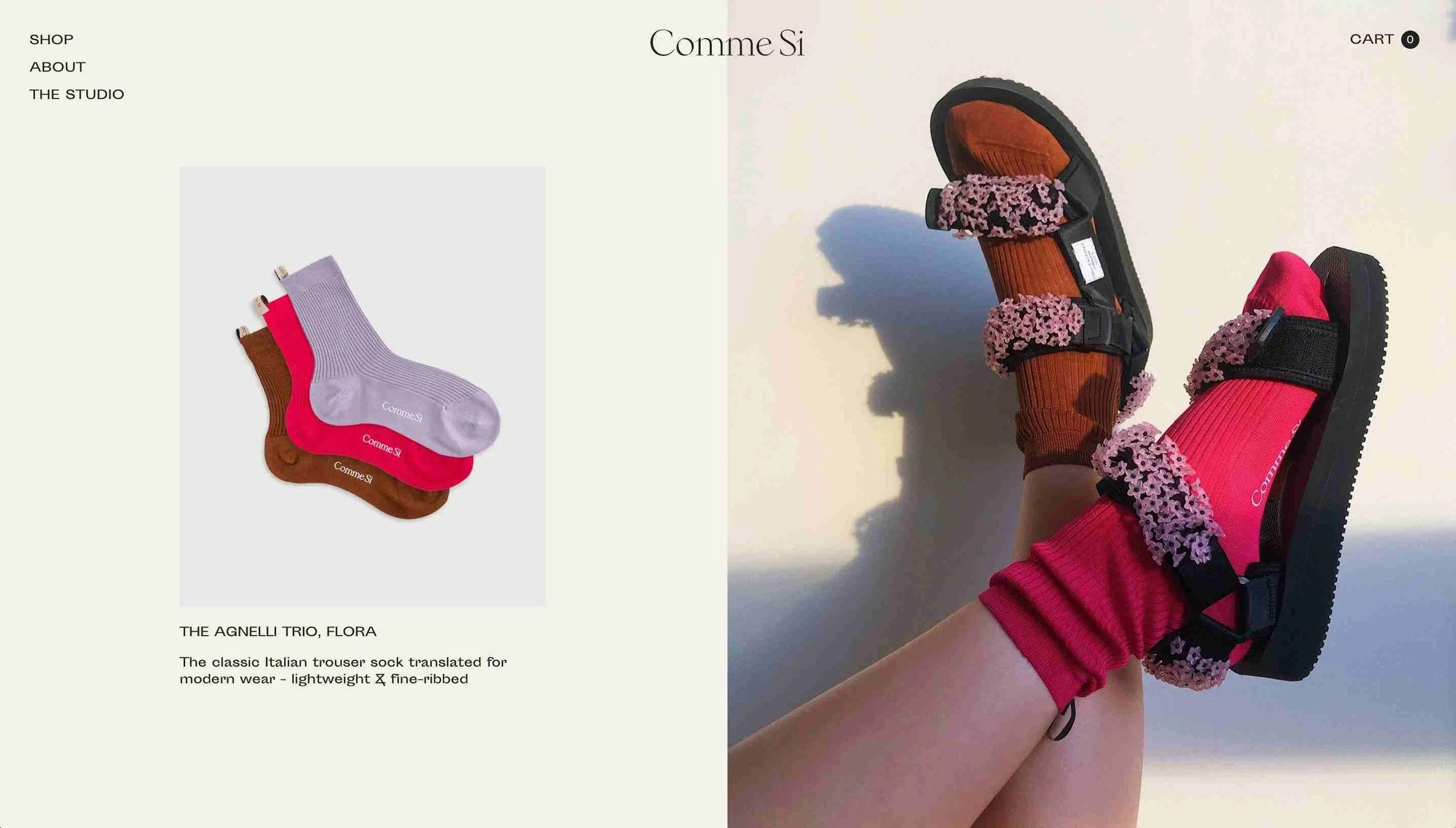
Websites students picked to recreate

Websites students picked to recreate

ChoosingInspo.png
 

🔥 Hot Tips

  1. Use what you've learned in the previous levels to help determine if the site you've chosen is possible in Squarespace. Don't be afraid to drop your inspo site in the #level3 channel for more feedback on what can be done!

  2. Need more inspo? Check out Site Inspire for examples of websites created specifically on Squarespace!

  3. Before you start, grab screenshots of your inspo site in case they decide to update their design! We like to use Full Page Screen Capture or the screenshot function that comes with your computer works too!

  4. Show the #level3 channel your progress often and try to stop at < 10 hours. *Hint: you should be tracking your time 😎

  5. When you've finished 3.2, share your link and password in the #level3 channel. Ask for feedback from your fellow students. Then, take a big LONG nap and move on to 3.3!

giphy.gif
 

📒 Level 3.2
Resources

Below are some resources that might be helpful for this assignment. To go to the main Resource Library page, click here.

🍪 Suggested Cookie Rewards

💻 Website 3.3 Custom Site

For this assignment, you’re going to take everything you learned in this course so far and create any website you want. ☁️ This is the last assignment for Level 3 — you’re so close to touching that trophy! 🏆

Assignment Overview

Level 3.3’s assignment is to design a custom website. Yep! That’s right. You’ll be creating any website you want. But first, let's reaaaally think about what kind of site you want to create.


If you want to Squarespace freelance...
We don't recommend creating a portfolio site. If it’s for your art or photography or you have at least 3 cohesive pieces, then OK.

Otherwise, use this time to create spec work — aka non-paid, fake website for a real (or fake) brand that shows your potential.

Also, don’t use actual client work. Clients will get in the way. Design is subjective and they’re paying you to do what they want. Level 3.3 is YOUR TIME to shine, hunnnnie!

If you want to design for yourself/company...
What kind of work do you want to do? Think about the people in your network. Some students are already in a specific industry (eg, wellness, real estate, food) and want to take advantage of that. Others, like Puno, had to start fresh, but she knew she wanted to work with fun small businesses. Specifically, agencies/creatives, digital businesses, and low inventory e-commerce businesses. Go on Instagram and find websites that exist or even ones that could use YOUR HELP!

ilovecreatives-squarespace-level3.3.png

Objectives:

  • Clarify your design style

  • Show your potential to future clients

  • Learn how to grow from feedback

  • Show off what you can do!


Getting Started

You can start with a 7.0 or 7.1 trial site for this assignment. Once you have that new trial site, you can start recreating your custom site! We recommend creating a Site & Content Inventory for your spec client first. Fill it out as much as you would want a client to fill it out, but only give yourself an hour or two. Need a bit more guidance? Check out the 🔥Hot Tips and 📘Level 3.3 Resources sections below.

Site &amp; Content Inventory Google Doc

Site & Content Inventory Google Doc

Grading

Since these are custom sites, we don't have any specific grading criteria. We will provide one-on-one actionable feedback on the design, layout, and general branding for the site. We don’t grade on how much CSS you have, we are primarily looking at colors, choice of photos/graphics/illustrations (if you have them), how you use native features, and… fonts.

  • Can a user quickly digest the content of the website?

  • How can the site be more elevated? Does it feel unique?

  • Does it fit in with your design aesthetic?

You'll get two ✌️design critiques from Puno in a video format. Once you've made Puno’s suggested revisions from your first round of feedback, you’ll submit both sites again via the portal for a final review by Puno. Feel free to move on to Level 4 while you wait for feedback! 🎉

Ready to Submit?

Wooooo! 🎉 We ask that all students submit websites 3.2 and 3.3 together, so if you’re not done with 3.2 don’t submit just yet! If you’re done with both, remember to change your site visibility to password-protected and set the password to backandforth. Then, click the button below to submit via the course portal.

📹 Watch this video to see Bronze’s design critique for Mary Kate Hayden's custom website.


🔥 Hot Tips

  1. Watch Site & Content Inventory. Fill out as much as you can.

  2. If you’re feeling like, “I got this!” then go get em’ tiger! Rar! 🐅 Then create 3-5 Style Tiles using Photoshop, Sketch, Figma or Canva. Style Tiles give you a chance to play with colors, fonts, and take creative risks.

    • The goal is to nail down the aesthetic of a site before you get into laying everything out in Squarespace. Take notice of the liberties you took, we want you to feel your designer oats!

    • Make sure you also have some site inspo, photography (you can use watermarked photos), and fonts to work with.

    • For our new designers out there, you can also create them by grabbing screenshots and using Keynote/Google Slides/Canva. This is a great way to get those ideas flowing!

    • Style tiles typically include: heading 1, 2, and 3, body text, buttons, colors, and/or photo/graphic(s). This isn't about layout or navigation, this is just style. There isn't a specific way to do it, but we suggest playing around with 3 variations of 3-5 versions.

    • As soon as you can, drop them in the #level3 Discord channel so we can peep them. 👀 Don't be precious about Style Tiles, just get all of those ideas out of your head and onto that digital canvas.

    • More Instructions can be found here.

  3. Once you feel good about your Style Tile, create a Style Guide in Squarespace.

  4. Then try to design your website in < 10 hours. Start with just the homepage. Share it in the #level3 channel and get some feedback. Redeem 🍪s for extra design critiques. 🙌 Do another design pass for < 2 hours.

  5. Watch other student’s reviews in Discord.
    We always encourage students to share their feedback from Puno. Watch a few of them and see what they are looking for. It’s great insight into what you can expect — don’t be scared, we’re only here to help you!

  6. It’s OK to copy elements of other designs that you like, but do the work to make it your own.
    We want you to recreate a site that you loved so you can pick apart the decisions that created that design. If you’ve run out of ideas, take small pieces of other sites, BUT DO THE WORK TO MAKE IT YOUR OWN. Don’t be that jerk. If you aren’t sure if it looks too similar overall, then drop it in the Discord and get someone else’s opinion.

  7. Invest in fonts.
    Fonts make up most of the site. Investing in a font will reallllly take your site super far.

  8. CSS making you stressed?
    A few custom css tricks can up your design game (ahem, custom fonts!), but they aren't necessary to complete the course. Squarespace is PACKED with native features (aka blocks), so you don’t have to write too much CSS. Using the native features is also a great way to ensure a smooth hand off to your client. The rest is extra credit. 😉

  9. Need to take a break?
    Never feel embarrassed about "falling behind" — it's why this is a self-paced course! We know you gotta live your life. Know that you aren't alone and that it's the small incremental steps you take that can lead to the most growth. If you’re thinking about a break, hit up these Tips for Starting & Restarting.

Example Style Tiles


📘 Level 3.3 Resources

By this stage, our Resource Library can get overwhelming — fast. Keep your focus by first planning out your Site & Content Inventory and Style Tiles, and then look for the secondary resources that will help you get there.

🍪 Suggested Cookie Rewards

Take advantage of the Design Critique rewards from Mindy, Gabriel and Puno for some extra feedback! 💖

Screen Shot 2019-01-19 at 5.01.53 PM.png