Cats Flying Across the Screen
Cats Flying Across the Screen
If you are a Squarespace Student, please login to access this code snippet.
For more, check out our FAQs .
Make elements fly across the screen and surprise your visitors with this code snippet
Compatible with: Squarespace 7.0 & 7.1

Description
It’s a bird! It’s a plane! No, it’s Muad’Dib flying across your screen in all her glory ✨
Give your visitors an unexpected experience as you fly elements across their screen. Surprise them, awe them, make them smile!
1. Image Block
Add a new image block anywhere on the page.
You can add as many images as you like and use the code multiple times throughout your site.
Save your page.

2. Inspect Element
Open your your Dev Tool (Command+Shift+C) and look for the block-yui ID for the parent div containing the image
For example:

3. Custom CSS
Use the Custom CSS code for either Horizontal Slide or Diagonal Corners below and paste it in Design > Custom CSS
Replace #blockID in the Custom CSS with the #block-yui you copied from Step 2.
Example: #block-yui_3_17_2_1_1638382945834_2089
Horizontal Slide
Left → Right OR Right → Left
#blockID {
            /* For images, resize the entire block here */
          width: 300px;
            /* Duration: 1s is very fast, 30s is slow */
          animation-duration: 10s;
            /* Animation Direction: Choose "normal" for right to left, "reverse" for left to right and "alternate" to alternate directions */
          animation-direction: reverse;
            /* Animation Iteration: Choose "infinite" to repeat forever, choose a number "n" to repeat n times */
          animation-iteration-count: infinite;
            /* Animation Timing: Choose "linear" to fly at a constant speed, type cubic-bezier(0.4,1,1,0.1) for some variable speed funkiness */
          animation-timing-function: cubic-bezier(0.4,1,1,0.1);
          animation-name: ilcFly-Horizontal;
          max-width: 100%;
          position: fixed;
          z-index: 999 !important;
        }

        @keyframes ilcFly-Horizontal {
            0% {
                transform: translateX(100vw);
                top: 15vh;
            }

            100% {
                transform: translateX(-100vw);
                top: 15vh;
            }
        }
Diagonal Corners
Top Left → Bottom Right OR Bottom Right → Top Left
#blockID {
            /* For images, resize the entire block here */
          width: 300px;
            /* Duration: 1s is very fast, 30s is slow */
          animation-duration: 15s;
            /* Animation Direction: Choose "normal" for bottom right to top left, "reverse" for top left to bottom right and "alternate" to alternate directions */
          animation-direction: reverse;
            /* Animation Iteration: Choose "infinite" to rotate forever, choose a number "n" to rotate n times */
          animation-iteration-count: infinite;
            /* Animation Timing: Choose "linear" to fly at a constant speed, type cubic-bezier(0.4,1,1,0.1) for some variable speed funkiness */
          animation-timing-function: linear;
          animation-name: ilcFly-Diagonal;
          max-width: 100%;
          position: fixed;
          z-index: 999 !important;
          top: 0;
        }

        @keyframes ilcFly-Diagonal {
            0% {
                transform: rotate(15deg) translate(100vw, 100vh);
            }

            100% {
                transform: rotate(-15deg) translate(-100vw, -100vh);
            }
        }
💡 If you want to show this effect multiple times on one page, you don't need to duplicate @keyframes. Just duplicate the sections that start with #blockID
4. Customizations & How it Works
The @keyframes section defines an animation named ilcFly-Diagonal or ilcFly-Horizontal that makes an element fly across the screen.
For each #blockID, we specify which animation direction it should use with animation-name. This is how we link the image to the keyframe animation.
In the #blockID section, you'll see these configuration options:
width specifies the width of the block—this is how we'll resize image blocks
animation-duration specifies how long it takes to complete one keyframe cycle (ie. a single "flight")
animation-direction can reverse the animation to go right→left (normal) or left→right (reverse)
animation-iteration-count defines how many times the animation repeats. By saying infinite, it will repeat endlessly. You can also write a digit such as
1or2and the animation will stop after 1 cycle or 2 cycles, respectively.animation-timing-function defines the rate of rotation throughout one cycle. Linear means going at the same rate throughout, while other functions like
ease-in-outwill slow down the animation at the beginning and end of the cycle. More info here
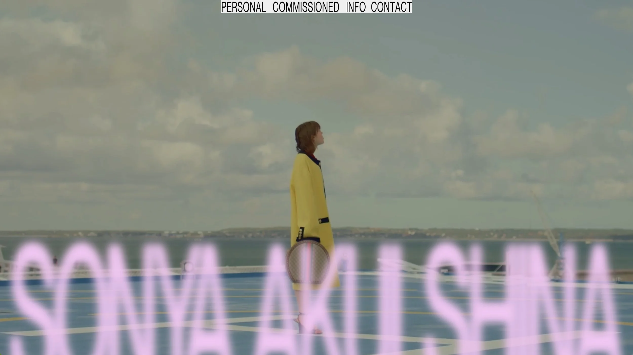
Related Examples
Internet✦Gems that use this feature!